(The following is a cross-post from the Lean Designs blog)
It gives me great pleasure to announce that you can now create hybrid width layouts using Lean Designs, letting you create professional looking websites in a fraction of the time compared to doing it by hand.
To understand the significance of this new feature and how to use it, we need to go over a bit of terminology:
Three types of layouts
Fixed Width
In a fixed width layout, the site is given a fixed, constant width which is then displayed (usually centered) in the browser. With this type of layout, you cannot use any of the excess space in the browser except for specifying the page’s background style (white in the example below).

Example:

Until today, fixed width layouts were the only type of design you could create with Lean Designs.
100% Width / Fluid Width / Liquid Width
In a 100% width/fluid width/liquid width layout, the width of the site is based on the width of the browser. Because the position of the the elements are based on the width of the page, they’ll appear differently to visitors depending on the width of their browser.

Example:

Fluid widths are not currently supported by Lean Designs.
Hybrid Width
Hybrid width layouts, as the name implies, takes pieces of both the fixed width and the 100% width layouts. With this type of layout the outer elements can have 100% widths, but their contents are held in a fixed width, centered container.

Example:

With today’s release, you can now create this type of design using Lean Designs. Note that the term hybrid width is not a standard web design term, but we needed a way to differentiate this type of layout from the fixed width and 100% width layouts.
Creating Hybrid Width Designs in Lean Designs
Creating hybrid width designs in Lean Designs is a piece of cake:
1. Add a DIV element to your designs
2. Position it against the left side of the canvas
3. Stretch it so that it spans the entire width of the canvas

When you export it, Lean Designs will recognize that you want this element to have a 100% width and generate the appropriate HTML/CSS.
For example, let’s add an H1 element, assign it an id of logo, assign the red element an id of header, and export it. This is what it will look like in the browser:

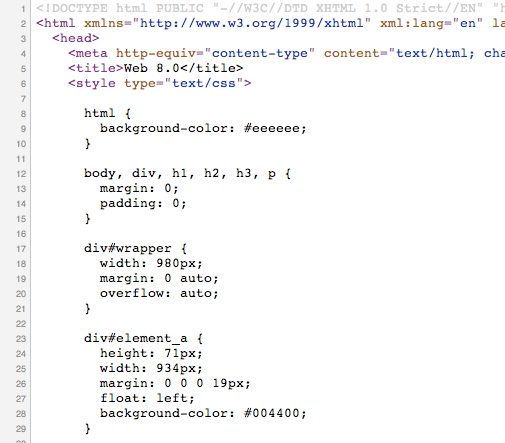
And here’s the HTML/CSS that Lean Designs generates:

Pretty cool huh?
OneHub Example
Lest you think this is only for creating simple, ugly sites, check out the following example of OneHub’s homepage re-created using Lean Designs in about 10 minutes:
In the editor:

Exported to HTML/CSS: (click here to view site)

Hope you like it. If you don’t have an account, you can sign up for free and create your own design in minutes.
As always, drop us a note if you run into any bugs or have ideas for improvement.
matt / matt@leandesigns.com

