99% of the queries I write to join tables wind up using JOIN (aka INNER JOIN) or LEFT JOIN so whenever there’s an opportunity to use one the other types, I get pretty excited 🙂. Today, that wound up being a CROSS JOIN.
Consider the following table containing charges:
This file contains hidden or bidirectional Unicode text that may be interpreted or compiled differently than what appears below. To review, open the file in an editor that reveals hidden Unicode characters.
Learn more about bidirectional Unicode characters
| DROP TABLE IF EXISTS charges; | |
| CREATE TABLE charges (id INT PRIMARY KEY AUTO_INCREMENT, amount DECIMAL(10,2)); | |
| INSERT INTO charges (amount) VALUES (18); | |
| INSERT INTO charges (amount) VALUES (15); | |
| INSERT INTO charges (amount) VALUES (27); | |
| +—-+——–+ | |
| | id | amount | | |
| +—-+——–+ | |
| | 1 | 18.00 | | |
| | 2 | 15.00 | | |
| | 3 | 27.00 | | |
| +—-+——–+ |
How would you add add a column showing how much each charge represents as a percentage of the total charges?
Option 1: Using a subquery
One way to solve this is to use a subquery:
This file contains hidden or bidirectional Unicode text that may be interpreted or compiled differently than what appears below. To review, open the file in an editor that reveals hidden Unicode characters.
Learn more about bidirectional Unicode characters
| SELECT *, ROUND(amount / (SELECT SUM(amount) FROM charges) * 100) AS percent | |
| FROM charges | |
| +—-+——–+———+ | |
| | id | amount | percent | | |
| +—-+——–+———+ | |
| | 1 | 18.00 | 30 | | |
| | 2 | 15.00 | 25 | | |
| | 3 | 27.00 | 45 | | |
| +—-+——–+———+ |
For each record, we divide the amount by the sum of all the amounts to get the percentage.
Option 2: Using a variable
Similar to the solution above, except here we save the sum of the amounts in a variable and then use that variable in the query:
This file contains hidden or bidirectional Unicode text that may be interpreted or compiled differently than what appears below. To review, open the file in an editor that reveals hidden Unicode characters.
Learn more about bidirectional Unicode characters
| SET @total := (SELECT SUM(amount) FROM charges); | |
| SELECT *, ROUND(amount / @total * 100) AS percent | |
| FROM charges; | |
| +—-+——–+———+ | |
| | id | amount | percent | | |
| +—-+——–+———+ | |
| | 1 | 18.00 | 30 | | |
| | 2 | 15.00 | 25 | | |
| | 3 | 27.00 | 45 | | |
| +—-+——–+———+ |
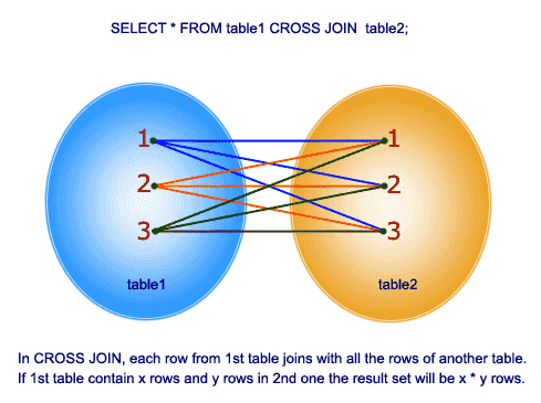
Option 3: Using CROSS JOIN
A cross join takes every row from the first table and joins it on every row in the second table. From w3resource.com:
In this solution, we create a result set with one value (the sum of the amounts) and then cross join the charges table on it. That will add the total to each record, which we can then divide the amount by to get the percentage:
This file contains hidden or bidirectional Unicode text that may be interpreted or compiled differently than what appears below. To review, open the file in an editor that reveals hidden Unicode characters.
Learn more about bidirectional Unicode characters
| SELECT *, ROUND(amount / total * 100) AS percent | |
| FROM charges | |
| CROSS JOIN (SELECT SUM(amount) AS total FROM charges) t; | |
| +—-+——–+——-+———+ | |
| | id | amount | total | percent | | |
| +—-+——–+——-+———+ | |
| | 1 | 18.00 | 60.00 | 30 | | |
| | 2 | 15.00 | 60.00 | 25 | | |
| | 3 | 27.00 | 60.00 | 45 | | |
| +—-+——–+——-+———+ |
If we didn’t want the total column in the result, we could simply exclude it:
This file contains hidden or bidirectional Unicode text that may be interpreted or compiled differently than what appears below. To review, open the file in an editor that reveals hidden Unicode characters.
Learn more about bidirectional Unicode characters
| SELECT id, amount, ROUND(amount / total * 100) AS percent | |
| FROM charges | |
| CROSS JOIN (SELECT SUM(amount) AS total FROM charges) t; | |
| +—-+——–+———+ | |
| | id | amount | percent | | |
| +—-+——–+———+ | |
| | 1 | 18.00 | 30 | | |
| | 2 | 15.00 | 25 | | |
| | 3 | 27.00 | 45 | | |
| +—-+——–+———+ |
In this case there shouldn’t be any performance gains using the CROSS JOIN vs one of the other methods, but I find it more elegant than the subquery or variable solutions.
CROSS JOIN vs INNER JOIN
Note that CROSS JOIN and INNER JOIN do the same thing, it’s just that because we’re not joining on a specific column, the convention is to use CROSS JOIN. For example, this produces the same result as the last CROSS JOIN example:
This file contains hidden or bidirectional Unicode text that may be interpreted or compiled differently than what appears below. To review, open the file in an editor that reveals hidden Unicode characters.
Learn more about bidirectional Unicode characters
| SELECT id, amount, ROUND(amount / total * 100) AS percent | |
| FROM charges | |
| INNER JOIN (SELECT SUM(amount) AS total FROM charges) t; | |
| +—-+——–+———+ | |
| | id | amount | percent | | |
| +—-+——–+———+ | |
| | 1 | 18.00 | 30 | | |
| | 2 | 15.00 | 25 | | |
| | 3 | 27.00 | 45 | | |
| +—-+——–+———+ |
And so does this:
This file contains hidden or bidirectional Unicode text that may be interpreted or compiled differently than what appears below. To review, open the file in an editor that reveals hidden Unicode characters.
Learn more about bidirectional Unicode characters
| SELECT id, amount, ROUND(amount / total * 100) AS percent | |
| FROM charges, (SELECT SUM(amount) AS total FROM charges) t; | |
| +—-+——–+———+ | |
| | id | amount | percent | | |
| +—-+——–+———+ | |
| | 1 | 18.00 | 30 | | |
| | 2 | 15.00 | 25 | | |
| | 3 | 27.00 | 45 | | |
| +—-+——–+———+ |
So why use CROSS JOIN at all? Per a Stack Overflow thread:
Using CROSS JOIN vs (INNER) JOIN vs comma
The common convention is:
* Use CROSS JOIN when and only when you don’t compare columns between tables. That suggests that the lack of comparisons was intentional.
* Use (INNER) JOIN with ON when and only when you have comparisons between tables (plus possibly other comparisons).
* Don’t use comma.
Props this Stack Overflow question for the tip about using CROSS JOIN to solve this type of problem.