The short version is that if you’re a Help Scout customer, you can sign up for Fivetran (for free!) and use it to get all of your mailbox data out of Help Scout and into a data warehouse like BigQuery. From there you can use SQL to analyze the data (on its own or combining it with your data from other services) or hook it up to a Business Intelligence tool for easy analysis and charting.
If this sounds interesting to you, check out the blog post and don’t hesitate to reach out if you have any questions about any of it: matt@helpscout.com.
Something I learned from Help Scout’s former Growth Lead, Suneet Bhatt, is that for every quantity metric you should also strive to have an associated quality metric.
For example, one of the metrics we look at is the number of New Customers. We also track Initial Average New Users Per Customer. Together these help us understand not just how many new customers we’re bringing in, but how large they are.
Quantity Metric: New Customers
Quality Metric: Initial Average New Users Per Customer
New Trials is a quantity metric. A quality metric for it might be the % of trials that convert into customers. I’ve found with my own products that that it’s easy to have either the quantity or quality metric go up, but hard to have both. For example, with Preceden, my timeline maker tool, New Trials tends to plummet during the summer months when students are not in school (a lot of students use Preceden to create timelines for class projects). When this happens, the trial to paid conversion rate goes way up because without a large number of students signing up (who rarely convert into paying customers), the conversion rate for the remaining trials winds up being pretty good. Then in the Fall when school resumes, trials increase as students begin signing up again, but trial to paid conversion rates fall. If I could find a way to increase conversion rates as more students sign up, it would be huge – but way easier said than done.
Quantity Metric: New Trials
Quality Metric: Trial to Paid Conversion Rate
Another example from Help Scout: we track how many new employees we hire, but also measure what % leave within 1 year. If our hiring process works well, the % that leave within a year should be fairly low; if not, it will be high.
Quanity Metric: New Employees
Quality Metric: 1-Year New Employee Churn Rate
When you’re thinking about your own business’s metrics, try to come up with quality metrics for most quantity metrics. You’ll gain a deeper understanding of the health of the business which allows you to make better decisions about its future.
At Help Scout today I had to perform an analysis that required me to identify the primary keys of deleted MySQL records.
For example, these results contain primary keys for records 1-5 but not 6-10:
This file contains hidden or bidirectional Unicode text that may be interpreted or compiled differently than what appears below. To review, open the file in an editor that reveals hidden Unicode characters. Learn more about bidirectional Unicode characters
The question is how to identify records 2, 3, 5, 7, and 8.
With the help of Stack Overflow, I found a neat solution that involves creating a temporary table of all possible primary keys, then left joining it on the original table to identify the missing ones. Here’s what it looks like, customized for my situation:
This file contains hidden or bidirectional Unicode text that may be interpreted or compiled differently than what appears below. To review, open the file in an editor that reveals hidden Unicode characters. Learn more about bidirectional Unicode characters
This solution does require that the keys be auto-incrementing, but that should be the case most of the time. Also, it assumes the last record is not deleted.
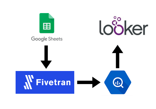
At Help Scout we use Fivetran to get data from various data sources (like our internal MySQL database, HubSpot, and Salesforce) into BigQuery so that we can analyze it all using Looker.
This means that if we want to know how many Unique Visitors we had each month, there’s no way to get that out of the Google Analytics via its API, which means Fivetran can’t grab it and automatically put it into BigQuery, which means we can’t have it in Looker.
Enter Fivetran’s Google Sheets integration
Fortunately, there is a hacky way to do it by taking advantage of Fivetran’s Google Sheets integration. Big picture, we’re going to manually export monthly Unique Visitors from the Google Analytics UI, put that data into a Google Sheet, then configure Fivetran to pull that data out of the Google Sheet and put it into BigQuery so we can analyze it with Looker. Here’s how the setup works:
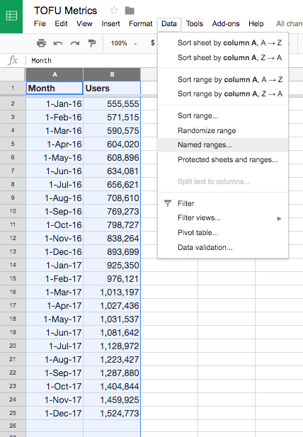
In our Google Sheet, we select the range of data we want then go to Data > Named ranges… to give it a name:
We give it a name that begins with fivetran_ such as fivetran_monthly_unique_visitors_test:
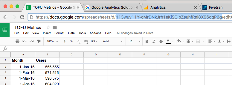
Next, we grab the Google Sheet ID from the URL:
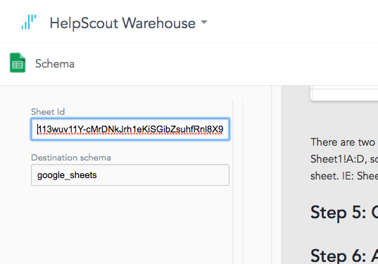
And paste that into Fivetran:
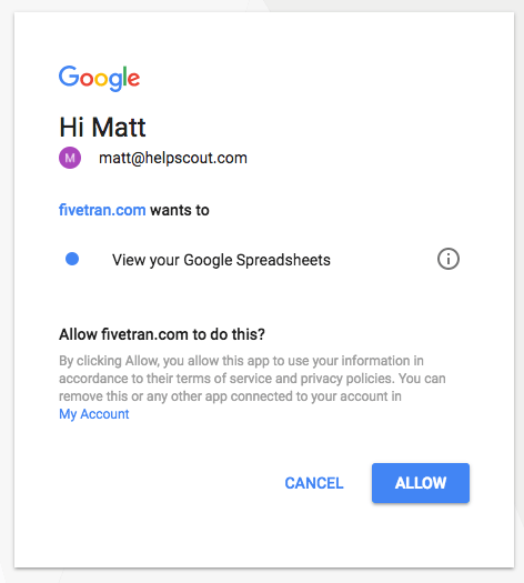
Authorize Fivetran to access Google Sheets:
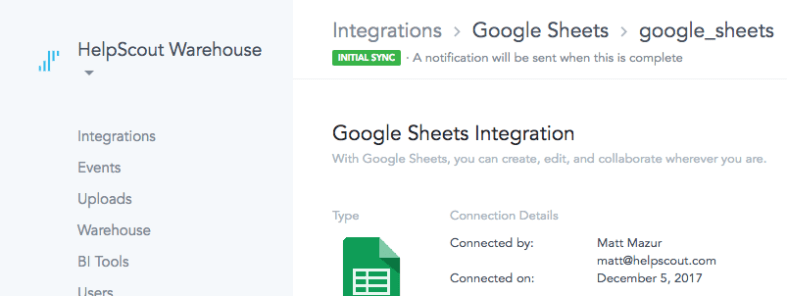
Fivetran will then kick off the initial sync:
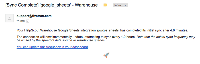
And then shoot you an email when it’s done:
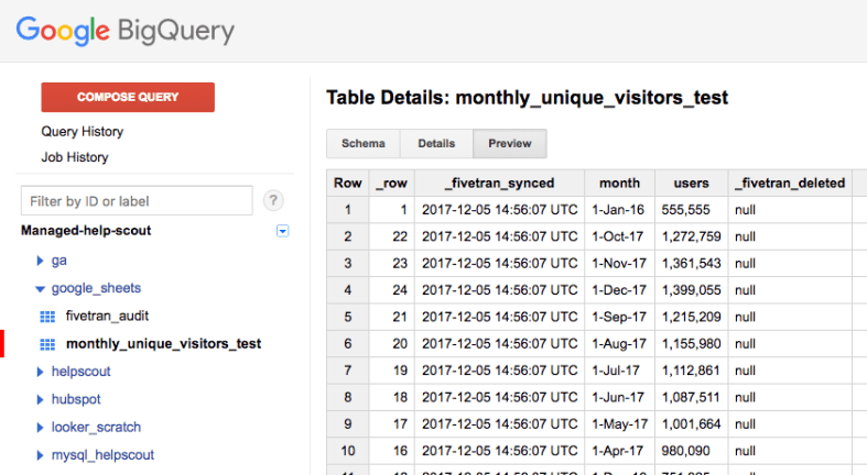
Now over in BigQuery, we can check to verify the table is synced:
Step 1, complete.
Next, lets create this chart in Looker
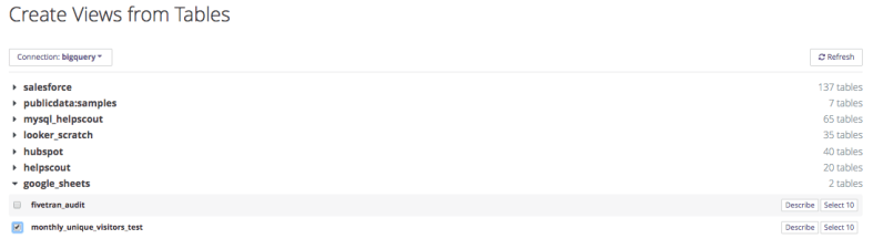
We’ll tell Looker we want to create a view from a table:
I had to click the Refresh button to get the Google Sheets table to appear:
Before tinkering with the view, here’s what the Google Sheet model might look like:
This file contains hidden or bidirectional Unicode text that may be interpreted or compiled differently than what appears below. To review, open the file in an editor that reveals hidden Unicode characters. Learn more about bidirectional Unicode characters
This file contains hidden or bidirectional Unicode text that may be interpreted or compiled differently than what appears below. To review, open the file in an editor that reveals hidden Unicode characters. Learn more about bidirectional Unicode characters
There is some hacky stuff going on here so let me explain what’s what:
In the Google Sheet, our dates are formatted like “1-Jan-16″. Looker has no idea what to do with that out of the box, so we need to use Standard SQL’s PARSE_DATE function to tell it how to parse it. The dimension expects a timestamp so we then need to cast the date to a timestamp. And because we’re only ever going to be using months here, we can get rid of the other date/time options leaving just months.
Similarly, the spreadsheet has numbers like “743,353″. This string isn’t a valid number, so we use REPLACE to eliminate the commas before casting it to an integer.
You might be wondering about the measure: in order to use this value in a chart, it has to be a measure, not a dimension. A hacky way to do that is just to use the measure type of max (though min or average or others will do too) which will just grab the maximum value for that date range – and since this value is the only value in the date range, it just returns the number of monthly uniques.
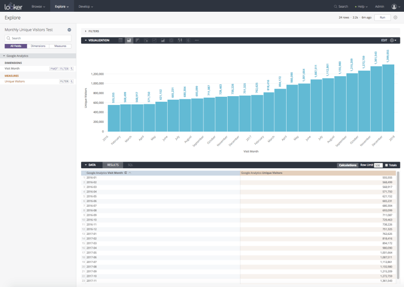
Back in Looker we can now create the chart:
The main downside to this is of course that you have to manually update the Google Sheet if you want the chart to update, but for something like Monthly Unique Visitors, updating it once a month isn’t a big deal. Though if you can think of an automated way to do it, I’d be interested to learn how.