
In order to level up my data visualization skills, I’m going to be attempting to implement well-designed charts that others have created on my own using R and eventually other tools. I’ll be open sourcing the code and sharing any lessons learned along the way.
For the first chart, I grabbed a seemingly simple chart from Scott Berinato’s excellent book, Good Charts: The HBR Guide to Making Smarter, More Persuasive Data Visualizations.
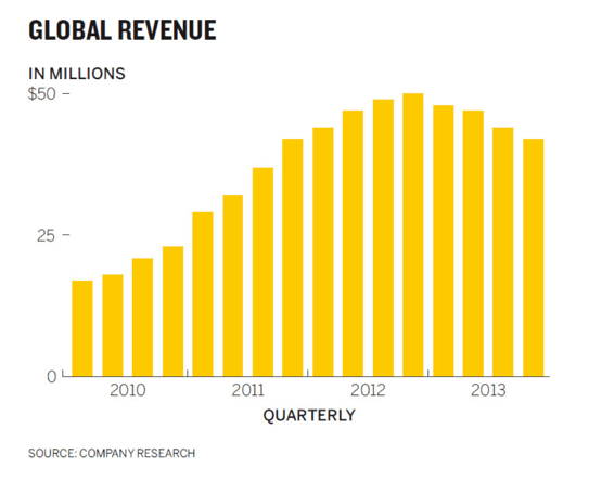
Here’s the chart that I set out to reproduce in R (he created it in Illustrator):
Here’s my attempt using R and ggplot2 whose code you can find in my new data viz repo on GitHub:
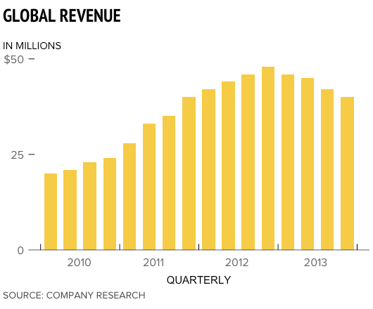
There were several tricky aspects of the original chart that presented challenges learning opportunities while implementing it in R:
- In order to get the chart title, y-axis title, and source aligned with the left side of the chart, I wound up having to use R’s Graphical User Objects aka “grobs”; hat-tip to this SO thread for the idea. It was possible to get pretty close by adjusting the hjust value for the chart title and subtitle, but the grob approach seemed less hacky.
- Speaking of hacky, I wasn’t able to figure out an elegant way to center the x-axis values between the ticks. I resorted to tinkering with the hjust value, but that just shifts them all to the right by a fixed amount. The problem is that some text like “2010” is wider than other text like “2011” which makes it impossible to get them all centered by shifting them by the same fixed amount. If anyone has a solution to this, I’d love to learn a better way to do it.
- Removing the tick for the bottom ($0) y-axis value was “fun”: I had to make it transparent because I couldn’t figure out how to remove it completely. Again, Stack Overflow is awesome.
- From a coding best practices perspective, there were several appearance-related values that had to be used in multiple locations in the code. To avoid duplication, I stored them in variables at the top of the script. It seems strange though having some appearance values stored in variables but others directly in the ggplot2 code. Storing all of the appearance values in variables – even the ones only used once – seems like bad practice too though.
- I couldn’t figure out how to get the ends of the x-axis line to stop at the ticks so they wind up extending beyond them slightly in my version.
- I’m not sure what fonts Scott used in Illustrator to create this chart, but even if I was 100% sure I don’t want to shell out money to buy custom fonts for this little project, so I used similar ones that were already available on my Macbook (PT Sans Narrow for the title, Proxima Nova for everything else).
- Towards the end there were diminishing returns trying to get everything pixel perfect so I settled on a 90% good enough solution.
As I recreate more of charts there will undoubedly be “a-ha!” moments that cause me to go back and clean up the code for my old charts. I’ll try to share as many of those lessons learned here as well.
