Introducing Retentioneer, a retention analysis script written in R

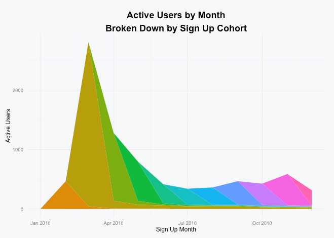
In an effort to continue learning R and gain a deeper understanding of how various metrics are calculated, I’ve been working on a few scripts to analyze user behavior. The first was the script that let you visualize your active users by signup cohort and today I’m happy to open source a new one, a retention analysis script that I’m calling Retentioneer (cause everything needs a cool name, right?).

Retentioneer is a script that lets you measure how long your app’s users remain active after signing up broken down by which month or year they signed up in. You can check it out on Github for complete instructions on how to use it and the configuration options available.

If you’ve never seen a retention curve before, here’s an example that you might make it clearer:

My friend Adam Weeks cofounded Brewski Me, a popular iPhone app which helps users keep track of the craft beer they drink. By running Brewski Me’s activity data through Retentioneer we get the following yearly retention curves:

brewskime-retention

By combining a little bit of knowledge about the history of the app with this chart, we can learn a lot:

From 2011 through 2013 Brewski Me had about a 34% 90-day retention rate, meaning that more than 1 in 3 users used it for longer than 3 months (side note: you can configure the script to count only users who were active exactly n-days days after signing up or count them if they were active on or after n-days).

Why the drop in 2014 in 2015? Three possibilities:

  • In mid-2014, Brewski Me changed from a paid app to a free app. We suspect that users who paid up front were more likely to be engaged long term compared to later users who could try it out for free.
  • Because we’re counting a user as retained if they were active at any point after 30, 60, 90 days etc, users who signed up in 2011 – 2013 have simply had more time to come back to the app compared to users who signed up in 2014 and 2015.
  • Finally, the rise of its main competitor Untappd and the social network effects it created may have led some users to switch away from Brewski Me.

In future posts I’ll go into more detail on some of the things I learned working on this including the impact of using activities measured to the second vs measured by just the date and how segmenting your users before running their activity data through this script might make more sense depending on the type of app.

Visualizing Your SaaS App’s Monthly Active Users Broken Down by Signup Cohort

This week at Automattic I’ve been helping with a tool that will allow us to visualize the number of active WordPress.com users each month broken down by when those users signed up for an account. I think this type of chart and what you can learn from it are incredibly valuable so I wanted to show you all how to quickly create one for your own service.

Here’s an example of what this type of chart looks like courtesy of Buffer’s Joel Gascoigne:

What I really like about it is that for each month you can see how many active users there are and when those users signed up for an account. This not only gives you a sense how long ago your active users signed up, but also of your service’s ability to retain users over time.

If you’d like to create a similar chart to visualize your SaaS app’s active users, I put together a small R script on Github that will help you do just that.

The only thing that you need to provide the script is a CSV file that contains user IDs and dates that those users performed an action in your app.

For example, the test data set that comes with it contains user IDs and actions performed by users of one of my apps (Preceden, a web-based timeline maker) for the first year that the site existed (as determined by the automatically set created_at and updated_at values on the Ruby on Rails Active Record objects that each user is associated with):

2   2010-03-28
2   2010-04-09
2   2010-04-10
2   2010-05-16
3   2010-01-31
3   2014-05-07
3   2014-09-30
3   2015-04-11
4   2010-01-31
4   2010-10-06
...

In this example user IDs 2 and 3 each performed actions on four dates and user ID 4 performed actions on 2 dates. The script will analyze that data to figure out which cohort the user belongs to based on the earliest date the user performed an action and count that user toward the active users for each subsequent month that he or she performed an action:

monthly

As you can see there was a huge spike at the beginning of the year when Preceden launched on HackerNews and was subsequently covered on other tech sites, but by December only a fraction of those users were still active. On that note, I encourage you to strive to build a service like Buffer that delivers long term value so your chart doesn’t wind up looking like this one :).

If you have any questions or need help customizing the script in any way, please don’t hesitate to drop me a note.

Thanks Joel Martinez and Rob Felty for providing feedback on the code.