Creating a stacked area chart in R is fairly painless, unless your data has gaps. For example, consider the following CSV data showing the number of plan signups per week:
This file contains hidden or bidirectional Unicode text that may be interpreted or compiled differently than what appears below. To review, open the file in an editor that reveals hidden Unicode characters.
Learn more about bidirectional Unicode characters
| +————+———-+———+ | |
| | week | plan | signups | | |
| +————+———-+———+ | |
| | 2017-01-26 | Bronze | 10 | | |
| | 2017-01-26 | Gold | 55 | | |
| | 2017-01-26 | Standard | 108 | | |
| | 2017-02-05 | Bronze | 6 | | |
| | 2017-02-05 | Iron | 1 | | |
| | 2017-02-05 | Gold | 37 | | |
| | 2017-02-05 | Standard | 142 | | |
| | 2017-02-12 | Bronze | 17 | | |
| | 2017-02-12 | Iron | 2 | | |
| | 2017-02-12 | Gold | 42 | | |
| | 2017-02-12 | Standard | 119 | | |
| | 2017-02-19 | Bronze | 11 | | |
| | 2017-02-19 | Gold | 26 | | |
| | 2017-02-19 | Silver | 4 | | |
| | 2017-02-19 | Platinum | 1 | | |
| | 2017-02-19 | Standard | 70 | | |
| | 2017-02-26 | Bronze | 13 | | |
| | 2017-02-26 | Silver | 5 | | |
| | 2017-02-26 | Standard | 52 | | |
| +————+———-+———+ |
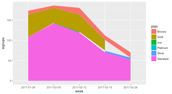
Plotting this highlights the problem:
This file contains hidden or bidirectional Unicode text that may be interpreted or compiled differently than what appears below. To review, open the file in an editor that reveals hidden Unicode characters.
Learn more about bidirectional Unicode characters
| library(ggplot2) | |
| data <- read.csv("dummy-data.csv", sep = "\t") | |
| g <- ggplot(data, aes(x = week, y = signups, group = plan, fill = plan)) + | |
| geom_area() | |
| print(g) |

The reason the gaps exist is that not all plans have data points every week. Consider Gold, for example: during the first four weeks there are 55, 37, 42, and 26 signups, but during the last week there isn’t a data point at all. That’s why the chart shows the gap: it’s not that the data indicates Gold went to zero signups the final week; it indicates no data at all.
To remedy this, we need to ensure that every week contains a data point for every plan. That means for weeks where there isn’t a data point for a plan, we need to fill it in with 0 so that R knows that the signups are in fact 0 for that week.
I asked Charles Bordet, an R expert who I hired through Upwork to help me level up my R skills, how he would go about filling in the data.
He provided two solutions:
1. Using expand.grid and full_join
This file contains hidden or bidirectional Unicode text that may be interpreted or compiled differently than what appears below. To review, open the file in an editor that reveals hidden Unicode characters.
Learn more about bidirectional Unicode characters
| data <- read.csv("data.csv", sep = "\t") | |
| weeks <- unique(data$week) | |
| plans <- unique(data$plan) | |
| combinations <- expand.grid(week = weeks, plan = plans) | |
| data <- full_join(data, combinations, by = c("week" = "week", "plan" = "plan")) %>% | |
| mutate(signups = ifelse(is.na(signups), 0, signups)) %>% | |
| arrange(week, plan) | |
| g <- ggplot(data, aes(x = week, y = signups, group = plan, fill = plan)) + | |
| geom_area(position = "stack") | |
| print(g) |
Here’s how it works:
expand.grid creates “a data frame from all combinations of the supplied vectors or factors”. By passing it in the weeks and plans, it generates the following data frame called combinations:
This file contains hidden or bidirectional Unicode text that may be interpreted or compiled differently than what appears below. To review, open the file in an editor that reveals hidden Unicode characters.
Learn more about bidirectional Unicode characters
| week plan | |
| 1 2017-01-26 Bronze | |
| 2 2017-02-05 Bronze | |
| 3 2017-02-12 Bronze | |
| 4 2017-02-19 Bronze | |
| 5 2017-02-26 Bronze | |
| 6 2017-01-26 Gold | |
| 7 2017-02-05 Gold | |
| 8 2017-02-12 Gold | |
| 9 2017-02-19 Gold | |
| 10 2017-02-26 Gold | |
| 11 2017-01-26 Standard | |
| 12 2017-02-05 Standard | |
| 13 2017-02-12 Standard | |
| 14 2017-02-19 Standard | |
| 15 2017-02-26 Standard | |
| 16 2017-01-26 Iron | |
| 17 2017-02-05 Iron | |
| 18 2017-02-12 Iron | |
| 19 2017-02-19 Iron | |
| 20 2017-02-26 Iron | |
| 21 2017-01-26 Silver | |
| 22 2017-02-05 Silver | |
| 23 2017-02-12 Silver | |
| 24 2017-02-19 Silver | |
| 25 2017-02-26 Silver | |
| 26 2017-01-26 Platinum | |
| 27 2017-02-05 Platinum | |
| 28 2017-02-12 Platinum | |
| 29 2017-02-19 Platinum | |
| 30 2017-02-26 Platinum |
The full_join then takes all of the rows from data and combines them with combinations based on week and plan. When there aren’t any matches (which will happen when a week doesn’t have a value for a plan), signups gets set to NA:
This file contains hidden or bidirectional Unicode text that may be interpreted or compiled differently than what appears below. To review, open the file in an editor that reveals hidden Unicode characters.
Learn more about bidirectional Unicode characters
| week plan signups | |
| 1 2017-01-26 Bronze 10 | |
| 2 2017-01-26 Gold 55 | |
| 3 2017-01-26 Standard 108 | |
| 4 2017-02-05 Bronze 6 | |
| 5 2017-02-05 Iron 1 | |
| 6 2017-02-05 Gold 37 | |
| 7 2017-02-05 Standard 142 | |
| 8 2017-02-12 Bronze 17 | |
| 9 2017-02-12 Iron 2 | |
| 10 2017-02-12 Gold 42 | |
| 11 2017-02-12 Standard 119 | |
| 12 2017-02-19 Bronze 11 | |
| 13 2017-02-19 Gold 26 | |
| 14 2017-02-19 Silver 4 | |
| 15 2017-02-19 Platinum 1 | |
| 16 2017-02-19 Standard 70 | |
| 17 2017-02-26 Bronze 13 | |
| 18 2017-02-26 Silver 5 | |
| 19 2017-02-26 Standard 52 | |
| 20 2017-02-26 Gold NA | |
| 21 2017-01-26 Iron NA | |
| 22 2017-02-19 Iron NA | |
| 23 2017-02-26 Iron NA | |
| 24 2017-01-26 Silver NA | |
| 25 2017-02-05 Silver NA | |
| 26 2017-02-12 Silver NA | |
| 27 2017-01-26 Platinum NA | |
| 28 2017-02-05 Platinum NA | |
| 29 2017-02-12 Platinum NA | |
| 30 2017-02-26 Platinum NA |
Then we just use dplyr’s mutate to replace all of the NA values with zero, and voila:
This file contains hidden or bidirectional Unicode text that may be interpreted or compiled differently than what appears below. To review, open the file in an editor that reveals hidden Unicode characters.
Learn more about bidirectional Unicode characters
| week plan signups | |
| 1 2017-01-26 Bronze 10 | |
| 2 2017-01-26 Gold 55 | |
| 3 2017-01-26 Iron 0 | |
| 4 2017-01-26 Platinum 0 | |
| 5 2017-01-26 Silver 0 | |
| 6 2017-01-26 Standard 108 | |
| 7 2017-02-05 Bronze 6 | |
| 8 2017-02-05 Gold 37 | |
| 9 2017-02-05 Iron 1 | |
| 10 2017-02-05 Platinum 0 | |
| 11 2017-02-05 Silver 0 | |
| 12 2017-02-05 Standard 142 | |
| 13 2017-02-12 Bronze 17 | |
| 14 2017-02-12 Gold 42 | |
| 15 2017-02-12 Iron 2 | |
| 16 2017-02-12 Platinum 0 | |
| 17 2017-02-12 Silver 0 | |
| 18 2017-02-12 Standard 119 | |
| 19 2017-02-19 Bronze 11 | |
| 20 2017-02-19 Gold 26 | |
| 21 2017-02-19 Iron 0 | |
| 22 2017-02-19 Platinum 1 | |
| 23 2017-02-19 Silver 4 | |
| 24 2017-02-19 Standard 70 | |
| 25 2017-02-26 Bronze 13 | |
| 26 2017-02-26 Gold 0 | |
| 27 2017-02-26 Iron 0 | |
| 28 2017-02-26 Platinum 0 | |
| 29 2017-02-26 Silver 5 | |
| 30 2017-02-26 Standard 52 |
2. Using spread and gather
The second method Charles provided uses the tidyr package’s spread and gather functions:
This file contains hidden or bidirectional Unicode text that may be interpreted or compiled differently than what appears below. To review, open the file in an editor that reveals hidden Unicode characters.
Learn more about bidirectional Unicode characters
| data <- read.csv("data.csv", sep = "\t") | |
| data <- data %>% | |
| tidyr::spread(key = plan, value = signups, fill = 0) %>% | |
| tidyr::gather(key = plan, value = signups, – week) %>% | |
| arrange(week, plan) | |
| g <- ggplot(data, aes(x = week, y = signups, group = plan, fill = plan)) + | |
| geom_area(position = "stack") | |
| print(g) |
The spread function takes the key-value pairs (week and plan in this case) and spreads it across multiple columns, making the “long” data “wider”, and filling in the missing values with 0:
This file contains hidden or bidirectional Unicode text that may be interpreted or compiled differently than what appears below. To review, open the file in an editor that reveals hidden Unicode characters.
Learn more about bidirectional Unicode characters
| week Bronze Gold Iron Platinum Silver Standard | |
| 1 2017-01-26 10 55 0 0 0 108 | |
| 2 2017-02-05 6 37 1 0 0 142 | |
| 3 2017-02-12 17 42 2 0 0 119 | |
| 4 2017-02-19 11 26 0 1 4 70 | |
| 5 2017-02-26 13 0 0 0 5 52 |
Then we take the wide data and convert it back to long data using gather The - week means to exclude the week column when gathering the data that spread produced:
This file contains hidden or bidirectional Unicode text that may be interpreted or compiled differently than what appears below. To review, open the file in an editor that reveals hidden Unicode characters.
Learn more about bidirectional Unicode characters
| week plan signups | |
| 1 2017-01-26 Bronze 10 | |
| 2 2017-01-26 Gold 55 | |
| 3 2017-01-26 Iron 0 | |
| 4 2017-01-26 Platinum 0 | |
| 5 2017-01-26 Silver 0 | |
| 6 2017-01-26 Standard 108 | |
| 7 2017-02-05 Bronze 6 | |
| 8 2017-02-05 Gold 37 | |
| 9 2017-02-05 Iron 1 | |
| 10 2017-02-05 Platinum 0 | |
| 11 2017-02-05 Silver 0 | |
| 12 2017-02-05 Standard 142 | |
| 13 2017-02-12 Bronze 17 | |
| 14 2017-02-12 Gold 42 | |
| 15 2017-02-12 Iron 2 | |
| 16 2017-02-12 Platinum 0 | |
| 17 2017-02-12 Silver 0 | |
| 18 2017-02-12 Standard 119 | |
| 19 2017-02-19 Bronze 11 | |
| 20 2017-02-19 Gold 26 | |
| 21 2017-02-19 Iron 0 | |
| 22 2017-02-19 Platinum 1 | |
| 23 2017-02-19 Silver 4 | |
| 24 2017-02-19 Standard 70 | |
| 25 2017-02-26 Bronze 13 | |
| 26 2017-02-26 Gold 0 | |
| 27 2017-02-26 Iron 0 | |
| 28 2017-02-26 Platinum 0 | |
| 29 2017-02-26 Silver 5 | |
| 30 2017-02-26 Standard 52 |
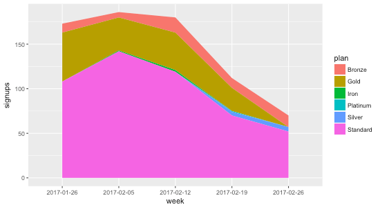
Using either methods, we get a stacked area chart without the gaps ⚡️:


