
Preceden, the web-based timeline maker that I launched in January 2010, has been slowly growing over the years and while I don’t spend that much time on it these days, I still try to put in a few hours each month to make it better and keep fresh on the code.
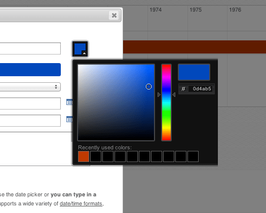
One feature that has always bugged me but that I’ve been procrastinating about fixing is the color picker for choosing the color of an event. Here’s what the interface has looked like for almost all of Preceden’s existence:
When I originally implemented this, my novice thought process went something like this:
- Users should be able to choose any color they want
- Building a flexible color picker is hard, so I’ll use an open source one
After a bit of research, I found one, modified it to get rid of some of the unnecessary fields, and added a recent colors section.
Perfect, right?
Well, it worked for the most part but if there’s one important thing I’ve learned building websites and web applications over the last few years is that the simpler you can make your interface, the better. Being able to choose any color sounds good, but in practice users have found this color picker confusing and hard to use. How do you choose normal green from the starting point above? Are you supposed to type something in that field on the right? Are are you supposed to know what hex color codes correspond to what colors?
If you’re building an application for designers having this level of customizability might be a good thing, but Preceden is used by a lot of students, teachers, and other people 99% of whom probably don’t know the difference between #FF0000 and #00FF00.
The straw that broke the camel’s back was this email that I received from a user, Caline, last Friday night:
Can you tell me why I might be having so much problems with the colour selector in Preceden timeline? I cannot get the slider or the moveable dot to work at all. To make colours I have been trial and error changing numbers of colours to make new colours, very frustrating. At least is there a list of colour numbers you can send me to enter?
Despite my best efforts to ensure the color picker worked across all browsers, issues always pop up every few months that make me want to find another profession. Because the color picker wasn’t working for her, Caline had resorted to typing in random numbers to generate different colors.
I responded to her email, apologized, asked her go to SupportDetails.com, download the PDF report, and send it to me so I could figure out what browser she was using in the hope that it would help me track down the cause of the bug. I also Googled “html color codes” and sent her a link to the top result, html-color-codes.info. I was about to move on and wait for her response to troubleshoot the issue when it hit me: this is crazy. The color picker has been a major pain for me and for Preceden’s users for years. It was time to fix it.
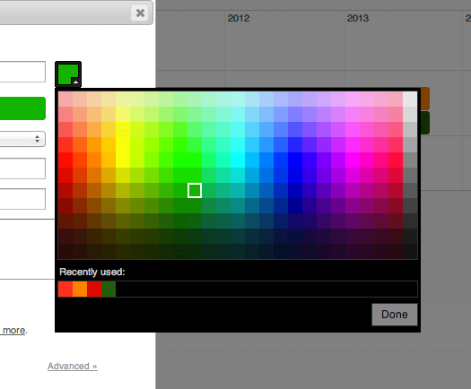
Using the colorful table on html-color-codes.info as a starting point, I set out to redesign the color picker from the ground up. Here is the result:
A few highlights:
- Users no longer have an option to enter a hex value. If you can’t find a color on that palette that suits you, Preceden probably isn’t the right product for you.
- The recently used colors are now actually sorted by when you last used it (the old version showed colors that were in use, but wasn’t sorted). It also shows 25 max instead of 10.
- For new events, the random color that it chooses (from a predefined list that I created using the colors on this palette that I think look the best) is guaranteed not to be one of the colors you recently used. This is important because most users want color variety and without any checks in place, the color that it assigned to a new event might have been the same color that was used for the last event, making your timeline look not quite as good as it could.
- The simplicity makes it much easier to ensure it works across all browsers.
- Because it’s a bit wide, if positioning it like the screenshot above makes it fall off screen, it’s automatically repositioned so that it falls on the screen (important for students who typically use Preceden in computer rooms with small monitors).
All of these should contribute towards a vastly better experience for one of Preceden’s most frequently used features. And it took about 3 hours. Why didn’t I do this sooner?
I wrote Caline and let her know about the new color picker. A few hours later she replied:
Hey this works great now, love the new colours palette. Thank you!!! :)
This makes my work so much easier. Thanks!!
My question now is whether this can be simplified even more. Users might not even need this quantity of colors to choose from. What do you think? Any suggestions?
