
This week at Automattic I’ve been helping with a tool that will allow us to visualize the number of active WordPress.com users each month broken down by when those users signed up for an account. I think this type of chart and what you can learn from it are incredibly valuable so I wanted to show you all how to quickly create one for your own service.
Here’s an example of what this type of chart looks like courtesy of Buffer’s Joel Gascoigne:
What I really like about it is that for each month you can see how many active users there are and when those users signed up for an account. This not only gives you a sense how long ago your active users signed up, but also of your service’s ability to retain users over time.
If you’d like to create a similar chart to visualize your SaaS app’s active users, I put together a small R script on Github that will help you do just that.
The only thing that you need to provide the script is a CSV file that contains user IDs and dates that those users performed an action in your app.
For example, the test data set that comes with it contains user IDs and actions performed by users of one of my apps (Preceden, a web-based timeline maker) for the first year that the site existed (as determined by the automatically set created_at and updated_at values on the Ruby on Rails Active Record objects that each user is associated with):
2   2010-03-28
2   2010-04-09
2   2010-04-10
2   2010-05-16
3   2010-01-31
3   2014-05-07
3   2014-09-30
3   2015-04-11
4   2010-01-31
4   2010-10-06
...
In this example user IDs 2 and 3 each performed actions on four dates and user ID 4 performed actions on 2 dates. The script will analyze that data to figure out which cohort the user belongs to based on the earliest date the user performed an action and count that user toward the active users for each subsequent month that he or she performed an action:
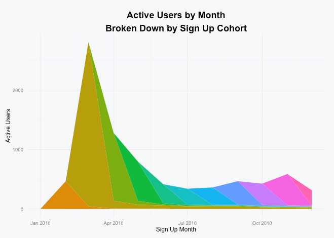
As you can see there was a huge spike at the beginning of the year when Preceden launched on HackerNews and was subsequently covered on other tech sites, but by December only a fraction of those users were still active. On that note, I encourage you to strive to build a service like Buffer that delivers long term value so your chart doesn’t wind up looking like this one :).
If you have any questions or need help customizing the script in any way, please don’t hesitate to drop me a note.
Thanks Joel Martinez and Rob Felty for providing feedback on the code.
