Today I had the opportunity to make a small adjustment to one line of code which had a striking effect on Domain Pigeon’s appearance.
Background
The shades of green for domains are calculated relative to the most popular domain.
For example, say DomainA the most popular and has been viewed 20 times. DomainB has been viewed 10 times, so it would be half as green as DomainA. DomainC, the straggler he is, has been viewed 5 times, making it only 25% as green as DomainA. Get the idea?
Most people who have visited Domain Pigeon have clicked on one of the Top 10 domains. It’s the first thing you see when you go to the site so it gets the most attention, which is great, but there’s a problem: Those Top 10 domains have 80+ views. The domains at the bottom of the page have 5-10 views, making them much much lighter than the domains at the top. It looked like they weren’t getting much attention. Lower attention implies lower traffic, which won’t bring people back as often, which is the opposite of what I want.
So, I had to find a way to make the less popular ones darker while ensuring that the popular ones remained distinct. The solution? Square root.
The most popular domain, using the earlier example, has a shade of green at (20/20) = 1. Take the square root and you’ve still got 1.
The second most popular domain has a shade of (10/20) = 0.5. Square Root of 0.5 = 0.71…
Another domain has a shade of (5/20) = 0.25. Square Root of 0.25 = 0.5…
Great success.
Results
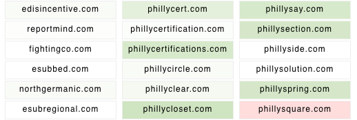
Before:
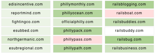
After:
These screen shots don’t really do it justice though. Check out Domain Pigeon to see the effect is has had.


