ALL IN Expert on Russian Poker Blog

ALL IN Expert, a poker equity calculator that I worked on back in 2008, still brings in a steady stream of traffic to this site.

I just ran across a post title “How do defend against shortstackers once and for all” from a Russian poker blog on how to defend against shortstackers (click here for the translation) which demos ALL IN Expert with a series of screenshots.

While ALL IN Expert never took off like I had hoped, I’m happy that people are still writing about it and finding it useful.

Adding a Survey to Preceden with Wufoo

Yesterday I added a survey to Preceden so users could tell me a bit more about their experience, and I think it’s going to be one of the best decisions I’ve made.

I chose to use Wufoo, a service for creating forms, rather than rolling my own because a) I hate making forms and b) I heard they make it easy.  It’s free to try and I’ve also heard they have great customer service, which is always a plus.

Patrick’s McKenzie’s post on integrating Wufoo into BingoCardCreator was my inspiration for doing this and I highly encourage anyone trying this to read his post too, as he has a lot of good ideas on incentivisation which I don’t cover here.

Wufoo has a slick web interface that lets you build a form by dragging and dropping controls onto it:

You also have the ability to customize the fields which makes it powerful, though it does so without being complicated. It’s clean, well thought out design is refreshing.

I added six question, which are based on the ones Patrick used for BingoCardCreator:

  • Male or female
  • Age
  • What do you use Preceden for?
  • What’s your favorite thing about Preceden?
  • How can we make Preceden better?
  • Would you be interested in using any of the following web applications? …

When you’re done, Wufoo will generate the JavaScript required to embed the form into your site:

I created a survey action in my home controller, with a corresponding survey.html.erb for their JavaScript:

And then I added a link to it from the user’s dashboard:

Clicking it takes you to the actual survey:

When users submit it, Wufoo sends me an email with the results, plus you can also check it on their website:

You’ll notice on the dashboard screenshot that there’s a small X in the top right corner of the survey notice.

I wanted users who have taken it or who don’t want to take it to be able to close the notice so it doesn’t show up forevermore on their dashboard. To do this, I added a surveyed attribute to the User model, which is set to false by default, but is changed to true when the user clicks that X.  Then on the dashboard I can say:


New! Help improve Preceden by taking our two minute .
'close'), :id => 'close-survey', :title => 'Hide this notice' %>

In total, integrating it took about two hours and it would have been a lot less if I didn’t want to keep track of who didn’t want to see it.

While there is already a contact form on the site, adding a survey link in a prominent location has already resulted in a great deal of  really good feedback. Here’s a snippet from one submission:

In no particular order :)

* Would love today’s date to automatically be in the ‘start’ box.

* An API so I can interface with our Bugzilla!
– This would boost other people sending data into preceden (hopefully) and raise awareness. Gosh, imagine a facebook app that logged and timeline’d exactly when you were on facebook. Ouch.
– I would love to see some kind of sync from preceden to Google Calendar (which in turn syncs with everything I own). Easier than developing multi-platform synchronization yourself!

This person probably wouldn’t have taken the time to write me an email, but by asking him directly “What do you want?” he opened up with a ton of useful ideas.

With Wufoo, there’s no excuse not to survey your users. For the amount of time it takes to do it and the value you gain from the results, it’s the easiest decision you’ll make all day.

Preceden’s Homepage Heatmap

About a week ago I signed up for CrazyEgg, a service that tracks where users are clicking on your site. It’s $9/mo for the cheapest plan and I figured I’d give it a try.

This, for example, is a heatmap generated by CrazyEgg showing the key areas where users are clicking on Precedens’ homepage:

Observations:

  • Lots of people click on the large green “Sign Up Now” button. (A clear call to action on the homepage is a big, big win for any web app.)
  • Lots of people click on the “Examples” link to learn more about the service.  I haven’t spent much time optimizing the Examples page, but it’s probably something I should do given its important role in converting users.
  • Lots of people click on the “Pricing” link, which makes sense. Interestingly, until several days ago there was no Pricing section at all; the price was only mention in the FAQs. However, I noticed that a lot of people were signing up and hitting the free account event limit, indicating that they weren’t aware of the restrictions so I decided to give the price its own, prominent section of the homepage. I predicted there would be a noticeable drop in the conversion rate, but after several days, it’s remained at about 13% (new users / new visitors from Google Analytics). I’m thinking that’s a really good thing, because if people are not dissuaded by the presence of a price (ahh!), it indicates that they’re at least willing to consider paying for the service.
  • Not a lot of people click on the “Buzz” link, but that’s OK. I might want to A/B test a few more testimonials on the homepage to see how it affects the conversion rate. (PS: I recently added this gem to the top of that page: “The fact that Preceden offers “layers” and “milestones” puts your product miles ahead of other timeline apps that I’ve seen” which is from an email I received).

I might not continue paying the $9/mo, but it’s well worth the $9 to get that initial analysis.

A Simple Fluid-Fixed Layout

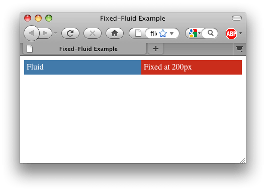
The illusive fluid-fixed layout has the following properties:

  • One column that expands to fill the screen
  • A second column that has a fixed width to the right of the expanding column

I rarely remember the CSS syntax to do this, so I’m posting it here both as a reference for myself as well as for anyone else looking for a solution.

Screenshot:

Code:

<html>
<head>
	<title>Fixed-Fluid Example</title>
	<style type="text/css">

		body {
			color: white;
		}

		#wrapper {
			float: left;
			width: 100%;
		}

		#fluid {
			background-color: #336699;
			margin-right: 200px;
		}

		#right-col {
			background-color: #bd2115;
			width: 200px;
			float: right;
			margin-left: -100%;
		}

		.padded-content {
			padding: 5px;
		}

	</style>
</head>
<body>
	<div id="wrapper">
		<div id="fluid">
			<div class="padded-content">Fluid</div>
		</div>
	</div>
	<div id="right-col">
		<div class="padded-content">Fixed at 200px</div>
	</div>
</body>