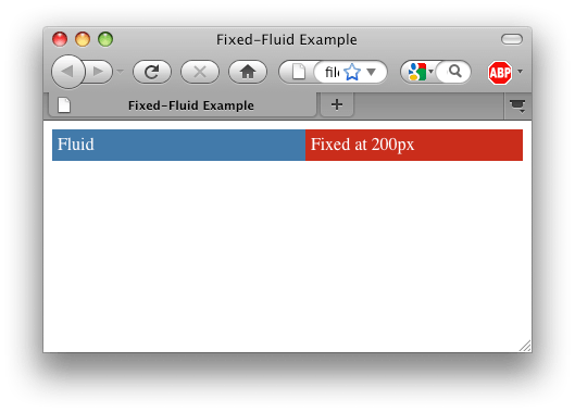
The illusive fluid-fixed layout has the following properties:
- One column that expands to fill the screen
- A second column that has a fixed width to the right of the expanding column
I rarely remember the CSS syntax to do this, so I’m posting it here both as a reference for myself as well as for anyone else looking for a solution.
Screenshot:
Code:
<html>
<head>
	<title>Fixed-Fluid Example</title>
	<style type="text/css">

		body {
			color: white;
		}

		#wrapper {
			float: left;
			width: 100%;
		}

		#fluid {
			background-color: #336699;
			margin-right: 200px;
		}

		#right-col {
			background-color: #bd2115;
			width: 200px;
			float: right;
			margin-left: -100%;
		}

		.padded-content {
			padding: 5px;
		}

	</style>
</head>
<body>
	<div id="wrapper">
		<div id="fluid">
			<div class="padded-content">Fluid</div>
		</div>
	</div>
	<div id="right-col">
		<div class="padded-content">Fixed at 200px</div>
	</div>
</body>

