
There was a great discussion on Twitter recently that began with Daniel Vassallo calling out a SaaS for not refunding an accidental annual payment he made on their service. He intended to purchase the monthly plan, but due to an unclear UI and poor copy, he unintentionally purchased the annual plan, and the business refused to refund it.
One of the responses to his tweet which I loved was “monthly billed annually is cursed copy”:
To give some background on the issue here, let me tell a quick story…
A very profitable A/B test
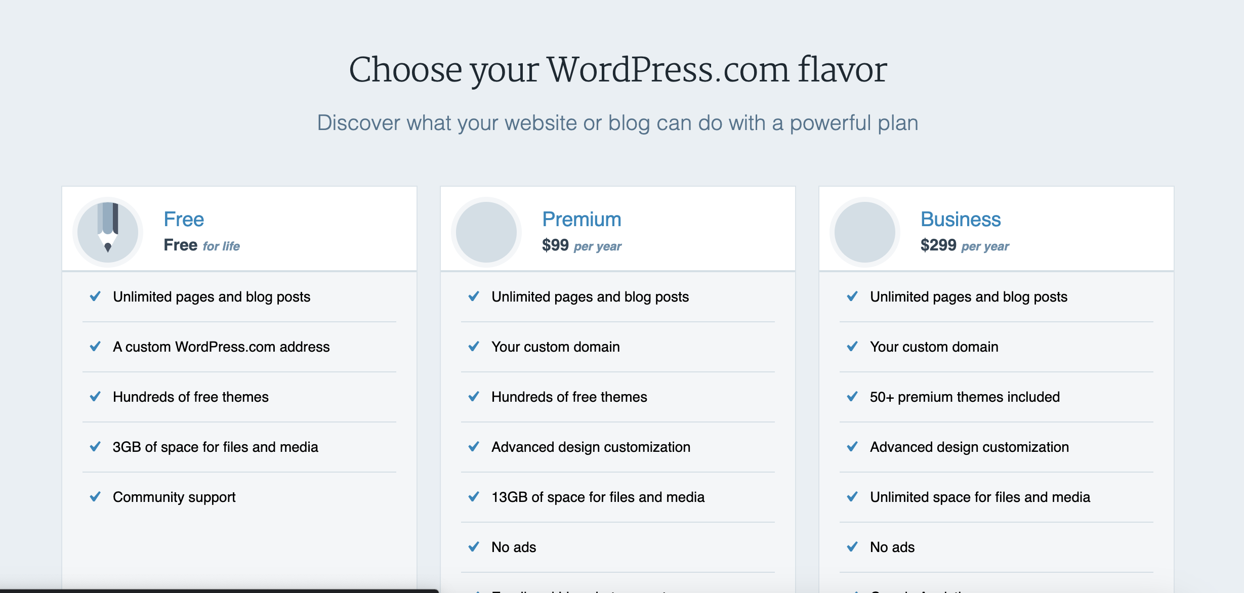
I used to work at Automattic, where I was as a developer on the business and marketing side of WordPress.com. For many years, WordPress.com only offered annual plans and their pricing page displayed those annual prices:
In the spring of 2016 Catherine Stewart, Automattic’s savvy Chief Business Officer, suggested we test displaying those prices as their monthly equivalents and see how it impacted new revenue. For example, instead of displaying “$99 per year”, we would display “$8.25 per month, billed yearly”. We would still charge users the full $99 and give them access to that plan for a year, but our plans and pricing page would display the lower monthly equivalent:
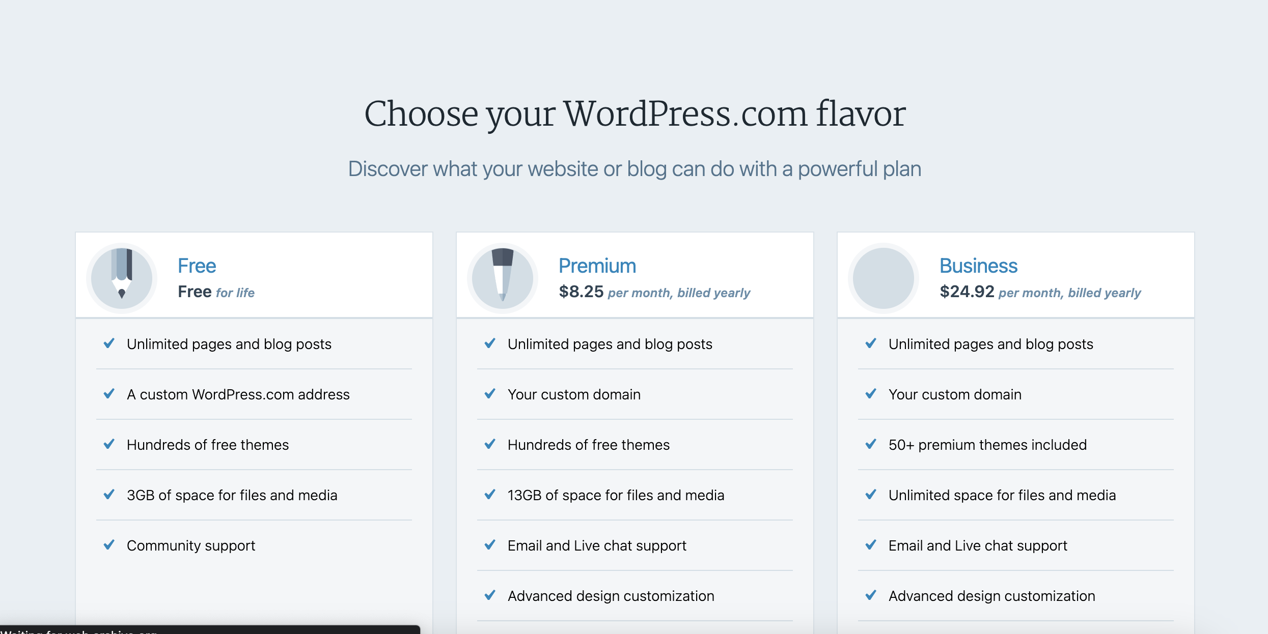
I implemented and A/B test and we let it run for a few weeks. The results? About a 10% increase in $/visitor to the pricing page (which is a better metric that $/customer or conversion rate alone, since it takes into account what % of visitors go onto pay, and how much they pay, though not refunds).
At WordPress.com’s scale, making 10% more per person who saw that page translated into a ton of additional revenue for the business.
Why it works
When people see “$8.25 per month billed yearly” people tend to perceive it as cheaper than “$99 per year”, so more people wind up buying.
At least that’s the hope. If you’re not careful though, you’ll get a lot of people paying annually who think they’re paying monthly.
Design matters
The problem that’s easy to run into is if you don’t have a great UI with clear copy, you’re going to get a lot of very frustrated customers who mistakenly purchase the annual plan.
Done well, customers will understand they are paying the $99 (or whatever it is for your SaaS) for a full year. Done poorly though, people will think they’re paying $8.25 for a month of access, and feel tricked when they eventually realize they actually paid $99 for a full year.
Here’s what the pricing looked like Daniel accidentally made his annual purchase:
As he noted in his tweet, that “Annual” toggle is very easy to miss. And unlike WordPress.com, this just says “$59 per month”, not “$59 per month billed annually”.
It’s an easy mistake to make
When I introduced monthly plans on Preceden (my SaaS timeline maker) a few years ago, I made the same mistake and it resulted in a lot of accidental annual purchases.
The plans default to annual pricing and displays monthly amounts billed annually:
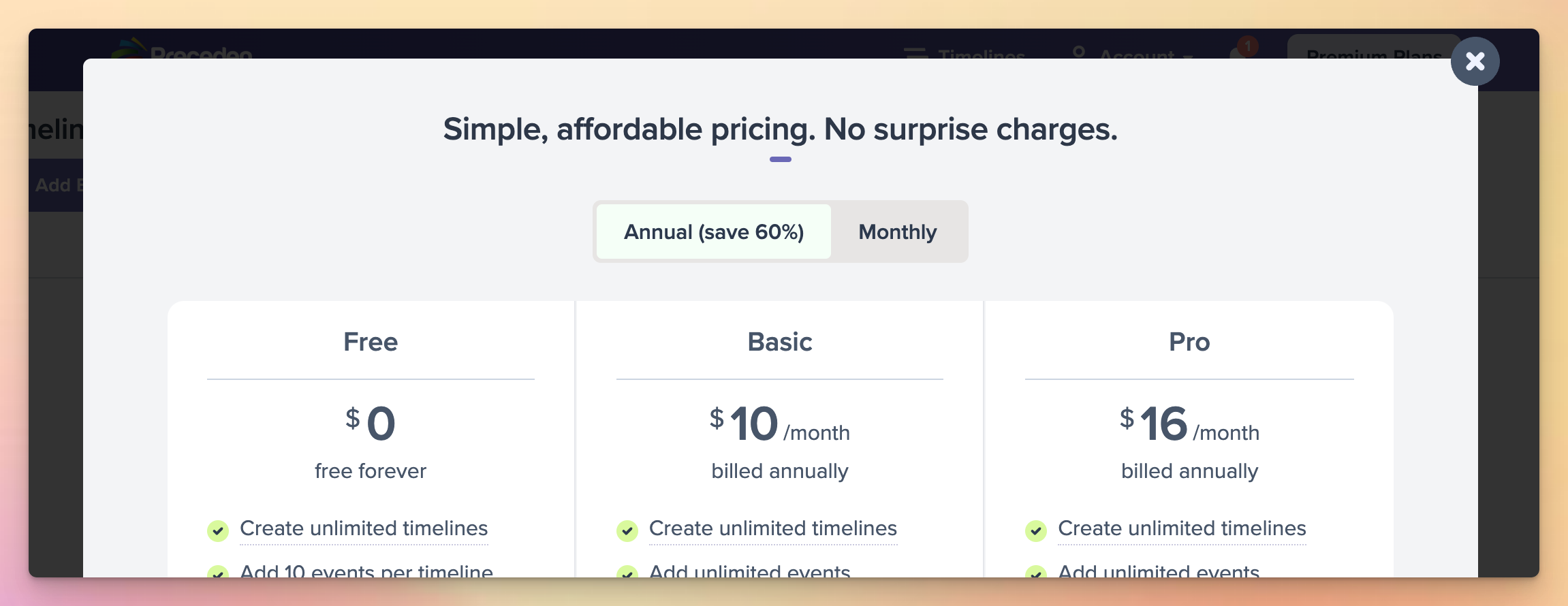
All good here I think.
The problem was with the next step, the payment form, which looked something like this:
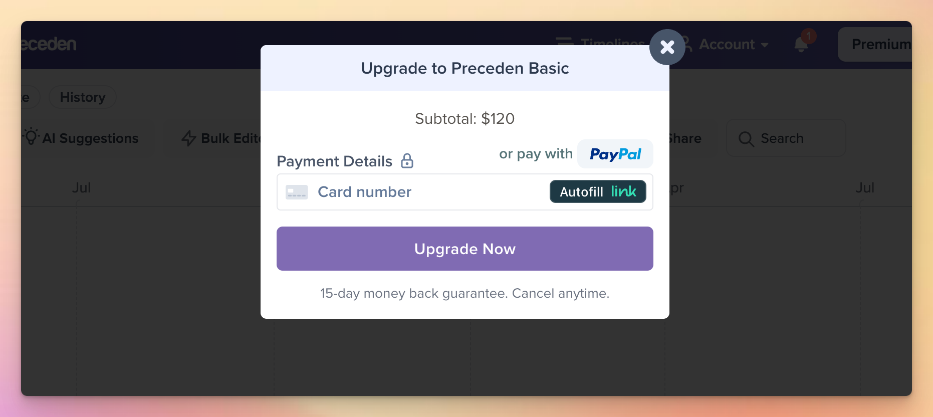
It did say “Subtotal: $120” but it was easy to miss, and a lot of people did, resulting in support requests like these:
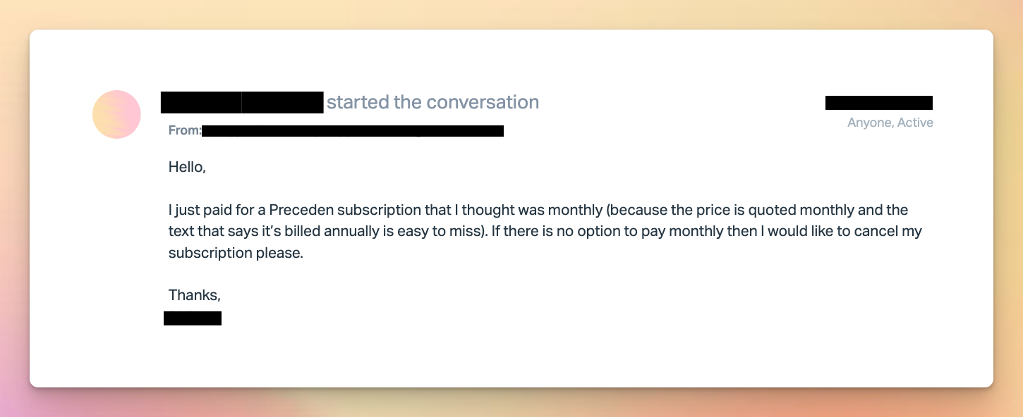
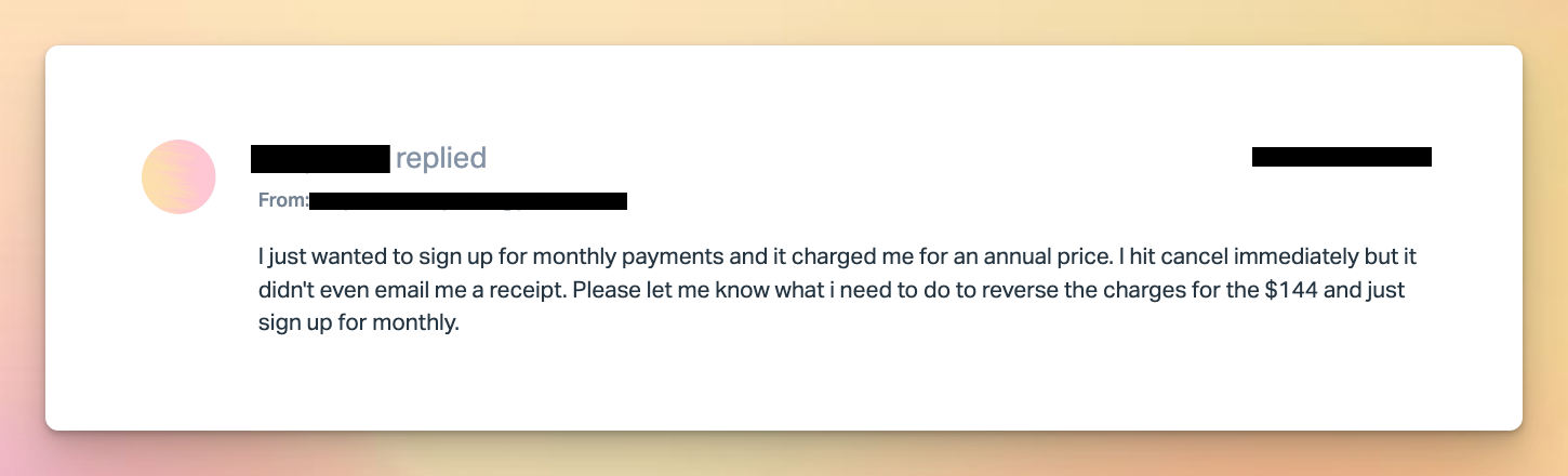
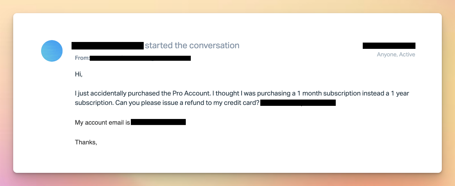
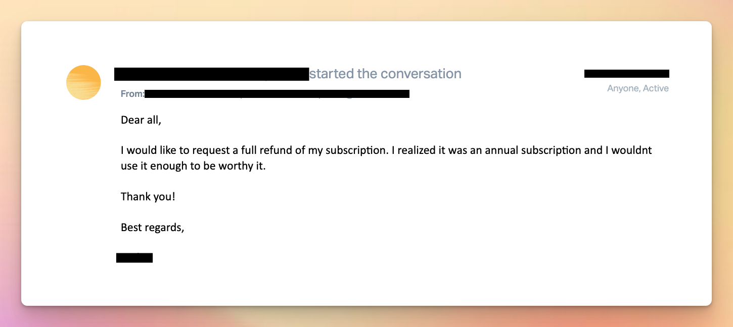
I always gave refunds, but it was clear that a lot of people were accidentally purchasing the annual plan, thinking they were paying monthly.
I don’t remember exactly how I stumbled across it, but I saw a screenshot of some SaaS’s pricing form that inspired a few changes to Preceden’s payment form.
Here’s the current design with those changes:
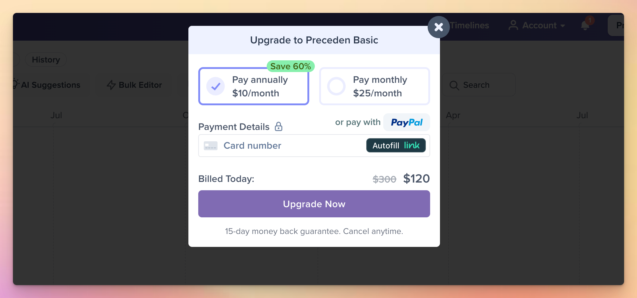
Two things to highlight:
- There’s a toggle to switch between annual and monthly directly on the payment form, making it super clear they have chosen annual and giving them an easy way to switch to monthly.
- The prominent “Billed Today” line immediately before the CTA including the full amount they will be paying.
After I made this change, the number of refund requests for accidental annual purchases dropped to zero and I felt a lot more confident that the people who were purchasing annually were doing it intentionally.
As for the SaaS that Daniel purchased from, they redesigned their pricing and wound up in a very similar place (though unlike Preceden, they don’t offer refunds):
One area for improvement might be for Preceden to display the annual amount in the interval toggle. Currently it displays “$10/month” (consistent with the pricing displayed on the plans in the prior step, and making it easier to understand the savings IMO), whereas with this SaaS, they are displaying the full annual price there ($708/year). I think because Preceden displays the “Billed Today” line with the full annual price below it, the way I’ve done it is fine (also given no refund requests anymore due to accidental annual payments), but I’m also open to changing it if anyone wants to make an argument that displaying “$120/year” there is better than “$10/month”.
Regardless, whatever you do for your SaaS, make sure it’s abundantly clear to users what they’ll be paying, and lean towards generously refunding purchases unless there’s a strong reason not to. You definitely don’t want to be on the receiving end of a viral tweet about your SaaS’s deceptive pricing. And even if you manage to avoid that, you should always do right by your customers which includes making it abundantly clear to them what they’re paying for your service.
