A/B Testing a Light vs Dark Design on Lean Domain Search

Lean Domain Search, the new domain name search engine I recently launched on HackerNews, has received extremely positive reviews, but one complaint that pops up fairly frequently is the color scheme.

Brian Graves recently wrote in the comments of one HackerNews thread:

The green on black is very harsh to my eyes. Have you considered alternate color schemes?

And one other commenter agreed:

I agree with the sentiment of the green on black. It does look harsh and 90’s stylish web 1.0. I would suggest doing A/B testing on some color schemas.

I decided to follow his advice and run an A/B test with different color schemes and see what affect it had, if any, on Lean Domain Search users.

The Battle Between Light and Dark

Before getting into the technical details, I’ll show you what the final versions of the site looked like.

On the left is the original dark version of the homepage, search results page, and about page. On the right is the alternate light version I wanted to test (click to zoom in):

A/Bingo > Google Website Optimizer

I’ve done a bit of A/B testing of headlines and call to action buttons using Google Website Optimizer, but I’ve never A/B tested an entire color scheme across multiple pages. If that’s possible with Google Website Optimizer, I don’t know how to do it. Fortunately, there’s a much better solution for Rails developers: Patrick McKenzie’s A/Bingo.

The two big selling points for me for A/Bingo are:

  • You can perform A/B tests in the controller, not just the views
  • You can quickly create new tests using only a few lines of code

There are few ways you could A/B test the color scheme using A/Bingo, the simplest being to overwrite your default stylesheet with a new one and measuring the results:

<%= ab_test("test_new_color_scheme", %w{yes no}) do |should_show| %>
   <%= stylesheet_link_tag("new_color_scheme") if should_show == 'yes' %>		
  <% end %>

Because of the way CSS works, any colors that are specified in new_color_scheme.css would take precedence over those in your default stylesheet.

Note that A/Bingo does support a true/false syntax, but using yes/no works better because you can add a test_new_color_scheme=yes parameter to a URL in development so that you can preview the new stylesheet and you can’t currently do that using A/Bingo’s true/false syntax.

bingo! if num_searches == 4

In Lean Domain Search’s case, I wanted to measure the impact on the number of searches a user performed. If the color scheme really was obnoxious, there should be a measurable difference in the number of searches performed. For example, maybe switching to a lighter design encourages people who would otherwise leave because of the harsh design stay longer because they don’t mind the light design as much.

Measuring the average number of searches per user would have been an ideal metric, but with traditional A/B testing you have to identify a single event as your conversion. As such, I chose to measure the percentage of visitors that made 4 or more searches.

Drum roll…

So which design resulted in a larger percentage of conversions? Well, neither.

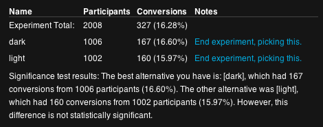
Here’s the results from A/Bingo:

In other words, 167 out of 1006 visitors who saw the dark design performed 4 or more searches and 160 out of 1002 who saw the light did the same. The result is, as A/Bingo notes, statistically insignificant.

But there’s more to it than conversion rates

The difference was insignificant so by the what-percent-of-people-perform-for-four-or-more-searches metric, it wouldn’t matter which design I chose.

Ultimately, I stuck with the dark design for three very subjective reasons:

    Despite a few folks not liking it, I’ve gotten a lot of feedback that people do like it too.
    Almost as as importantly, I like it. The more I like the product I am building, the more likely I am to continue building it.
    Everyone has a light site. Light is boring. Dark gives the site character (like I said, very subjective).

A few what-if’s to think about

What if the color scheme doesn’t make a difference on how many people make four searches, but it has a big difference on the percentage of people who make it to ten or twenty searches? Maybe the bright green’s effect is significant, but it takes longer for the difference to materialize.

What if the color scheme affects the percentage of people who buy a domain through Lean Domain Search? Maybe the bright green excites people more on average and they are more likely to buy.

What is the color scheme affects how long people spend on the search results page? Maybe people spend a significantly longer time on the page with the light background. What would that mean?

What if people are more likely to share Lean Domain Search because the dark color scheme makes it stand out?

What if changing the shade of green on the dark design produced a significant increase in the number of searches people make? (Did you know that Google A/B tested the affect of 41 different shades of blue? True story.)

What if the affect of introducing a site-wide design change for existing users (half of which open the site and have it gone from black to white) frustrates those users and makes them less likely to come back to the site?

What if measuring the number of searches is a poor metric? What if people make more searches because they haven’t found a domain name that they like?

I say this to make it clear that you should take this result — and any result — with a grain of salt. There are often second and third order effects of your changes and you need to think through them to make sure you didn’t miss something important. As Daniel Tenner notes, data is dangerous.

If you enjoyed this post, you should follow me on Twitter: @mhmazur. And check out Lean Domain Search, the best damn domain search engine ever.

Lean Domain Search: Two Weeks After the HackerNews Launch

Two weeks ago I launched Lean Domain Search, a new domain search tool, on HackerNews.

If you’re not familiar with it, Lean Domain Search pairs your search term with 1,000+ other keywords commonly found in domain names and instantly shows you which of the generated domain names are still available. It makes finding a great domain name for your website really, really easy.

I’ve launched four other apps on HackerNews (Domain PigeonHNTrendsPreceden, and jMockups/LeanDesigns) and Lean Domain Search was by far the one that was met with the most enthusiasm. And rightfully so — finding a great domain name is a problem that everyone with a web presence faces and until now — even with the existing tools — it’s been very hard to find a good one without spending a lot of time or money on it.

Traffic Overview

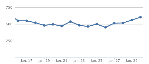
Here’s what week 1 looked like (click to view full size):

This is the typical pattern in each of the startups I’ve launched:

Launch day you get a huge boost of traffic from the early adopters checking out the new-hot-thing and then over the next few weeks it stabilizes at a much lower number. Consider: not everyone who visited that first day needed a domain name that day. What’s important is not how many visitors you get when you launch, it’s how many come back. Lean Domain Search saw 8,350 unique visitors the first day thanks to sitting on the HN frontpage for almost 20 hours. Two weeks later and with no major additional press coverage, that number of daily uniques has stabilized at around 400.

Traffic though is not a good indicator of quality — so how’s it actually doing?

Metrics Overview

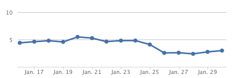
One important indicator of how useful the tool is is the average number of searches per visitor. If you find the tool useful, you’re more likely to make additional searches so tracking the averages searches per user is a pretty good indicator of quality. In this case, that number has steadily risen since the launch:

And this makes sense — launch day (Jan 16) had a lot of folks just checking it out so you’d expect the number of searches to be lower. As the ooh-shiny-thing traffic fades off, the people who are left are the ones who are actually using the tool for its intended purpose. Currently, the average number of searches per user is hovering at around 4.

The average number of available results has also steadily risen:

Again, I think this is simply due to the nature of the people who are using it — the longer you stick around, the more likely you are to search for less-common and obscure words which on average will return more available domain names. Currently, the average number of available domains returned per search is a little over 600 and I expect that number to go up a lot over next few weeks (more on that in a moment).

One thing I’ve spent a lot of time on since the launch is improving the quality and speed of the results. Here’s a graph showing the impact of my speed optimizations:

On launch day, the average search took 4.39 seconds (227 domains/second). Yesterday, the average search tool 2.98 seconds (335 domains/second), a 47% increase in speed (the duration distribution is actually bimodal — if you search for a phrase that has been searched for before, a cache will kick in and it will take fractions of a second; if you search for a new phrase, it takes a few seconds to perform the lookup; it averages out around 3s).

By the way, all of these metrics were tracked by Mixpanel. If you run a JavaScript heavy application, you absolutely should be using it to track your app’s analytics.

Finally, one important qualitative indicator is the number of positive things folks are saying about Lean Domain Search like “This is exactly what I need. I have been having difficulty looking for viable domain names that contain good keywords and that I can use as a business name as well. Great help.” and more colorfully “Holy balls that comes back with some quick results.” You can read the other testimonials here. :)

Design Improvements

Here’s the design on launch day and now (click to enlarge):

The overall design hasn’t change much, but there are a few notable exceptions.

  • Added filtering and sorting options (starts with search term, ends with search term, sort by length or alphabetical)
  • Added a News section where I can post significant updates for visitors
  • Added a Synonyms section which lists synonyms of your search term if they exist
  • Added Moniker and BlueHost to the list of registrars
  • Darkened the shade of green used for available search results
  • Changed the registration box from a fixed position to a draggable dialog box so users can move it out of the way
  • The registered search results are now hidden by default
  • The “Add to favorites” icon (which used to be a plus sign you’d see when hovering over a domain) is now in the registration options box — I did this because opening the registration options box now automatically triggers a “double-check” feature which confirms the availability of the domain name you clicked on and I don’t want users adding domains to their favorites that are actually registered
  • Added a testimonials link on the footer and removed the UserVoice suggestions link (no one was using it)

The Future (Viva la Revolución!)

With the major kinks worked out, it’s time to start looking forward.

Starting today (Monday, 30 Jan), I will add 100 new domains per week to the search results. From launch day until today, there have been 1,000 results when you search for a given term. Today, there are 1,100. Nine weeks from now, there will be 2,000 search results. And i’ll continue doing this as long as the quality of the results stays high and the servers can handle it.

Bottom line: it’s now easier than ever to find a great available domain name. If you’re launching a new blog, a startup, or any other endeavor that requires a new domain name, you should never have to pay a domain-squatter again.

Give Lean Domain Search a shot and let me know how to make it better.

Matt (@mhmazur)

Remembering AOL’s FDO91 Programming Language

Back in 1999 I cofounded AOL-Files.com, which eventually grew into the largest AOL hacking site of its kind.

One of the primary methods we used to discover exploits in the AOL software was by writing our own script’s using AOL’s Form Definition Order (FDO) programming language. From the AOL-Files FAQs on FDO:

FDO stands for Form Definition Operator. AOL communicates using this programming language. For example, after clicking any icon or button in AOL, FDO code is sent by the AOL system and interpreted by your AOL to create a window. So, the FDO language is the language used to describe forms on the AOL client. This site has focus on learning how to program in FDO and provides a surfeit of examples and tutorials for those who want to learn.

When BMB, Rob, and I started AOL-Files, FDO was all but unknown outside of the AOL development teams.

We did not have any official documentation, but through lots of experimentation we were able to figure out how FDO worked and eventually how to use it to discover holes in the AOL software and service.

Here, for example, are three tutorials I wrote back in the day as an introduction to FDO91 (the version of FDO in use at the time):

To give you an idea of how much we sought after an official manual, I wrote this in the first lesson:

FDO tutorials are unheard of. I have heard rumors that very few people at AOL have the FDO91 Manual. I will pay money for any professionally written, extensive, and full tutorial. Name your price.

A little dramatic maybe, but we really did want the official manuals. Rather than reverse engineer it through experimentation, an official manual would tell us exactly what did what and with that information we could discover exploits at a much faster rate than ever before. Alas, we never got ahold of one and had to make due with figuring it through trial and error.

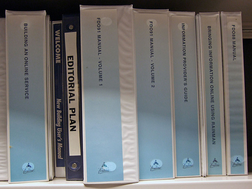
Why mention all this now? A friend recently pointed me to this photo on Flikr by Joe Loong:

We have:

  • Building an Online Service
  • New Building User’s Guide
  • Editorial Plan
  • FDO91 Manual – Volume 1
  • FDO91 Manual – Volume 2
  • Information Provider’s Guide
  • Bringing Information Online Using Rainman (more info on Rainman here)
  • FDO88 Manual

Wow. Only 12 years too late :)

How to Add Terminal Aliases in Mac OS X Lion

One quick productivity hack is to add command line aliases to your Terminal in Mac OS X.

For example, I prefer typing c instead of clear to clear the terminal and I usually add all sorts of shortcuts for cd’ing into directories that I use often.

Here’s how to do it:

1) Navigate to your home directory:

cd ~

2) Open up .bash_profile using vi:

vi .bash_profile

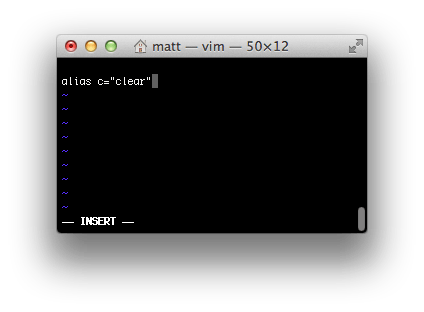
3) Add an alias (press i):

alias c="clear"

4) Save the file (press Escape, type :wq, and hit Enter)

5) Restart Terminal

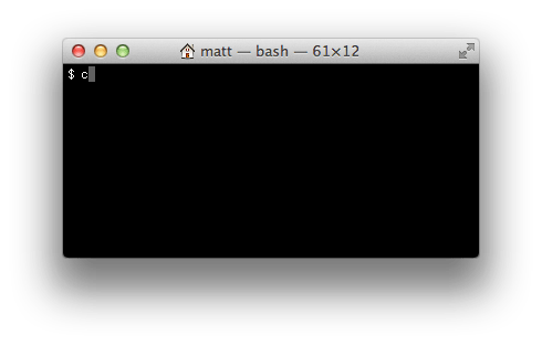
If you followed this example, you should now be able to just type c and Enter in Terminal to get the same affect as typing clear.

For more information, this post gives some additional examples of aliases you can add.