I’ve been tinkering around with R for learning more about the math behind A/B testing and figured I’d share some of the work as I go.
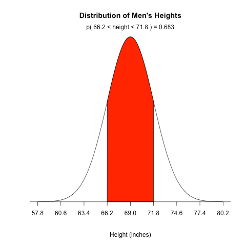
The website Stat Methods has an example showing how to plot a normal distribution for IQ scores, but as a beginner I found it hard to follow so I wound up re-writing it with comments, better variable names, and improved spacing. Also, instead of plotting IQ, I chose to plot men’s heights.
Here’s the final result:
And here’s the code:
# Men's heights are normally distributed with a population mean of 69.0 inches
# and a population standard deviation of 2.8 inches

population_mean <- 69
population_sd <- 2.8
sd_to_fill <- 1
lower_bound <- population_mean - population_sd * sd_to_fill
upper_bound <- population_mean + population_sd * sd_to_fill

# Generates equally spaced values within 4 standard deviations of the mean
# This is used to connect the points on the curve so the more points the better
x <- seq(-4, 4, length = 1000) * population_sd + population_mean

# Returns the height of the probably distribution at each of those points
y <- dnorm(x, population_mean, population_sd)

# Generate the plot, where:
# - type: the type of plot to be drawn where "n" means do not plot the points
# - xlab: the title of the x axis
# - ylab: the title of the y axis
# - main: the overall title for the plot
# - axes: when false it suppresses the axis automatically generated by the high level plotting function so that we can create custom axis
plot(x, y, type="n", xlab = "Height (inches)", ylab = "", main = "Distribution of Men's Heights", axes = FALSE)

# Connect all of the points with each other to form the bell curve
lines(x, y)

# Returns a vector of boolean values representing whether the x value is between the two bounds then
# filters the values so that only the ones within the bounds are returned
bounds_filter <- x >= lower_bound & x <= upper_bound
x_within_bounds <- x[bounds_filter]
y_within_bounds <- y[bounds_filter]

# We want the filled in area to extend all the way down to the y axis which is why these two lines are necessary
# It makes the first point in the polygon (lower_bound, 0) and the last point (upper_bound, 0)
x_polygon <- c(lower_bound, x_within_bounds, upper_bound)
y_polygon <- c(0, y_within_bounds, 0)

polygon(x_polygon, y_polygon, col = "red")

# Now determine the probability that someone falls between the two bounds so we can display it above the curve
# Remember that pnorm returns the probability that a normally distributed random number will be less than the given number
probability_within_bounds <- pnorm(upper_bound, population_mean, sd) - pnorm(lower_bound, population_mean, population_sd)

# Concatenate the various values so we can display it on the curve
text <- paste("p(", lower_bound, "< height <", upper_bound, ") =", signif(probability_within_bounds, digits = 3))

# Display the text on the plot. The default "side" parameter is 3, representing the top of the plot.
mtext(text)

# Add an axis to the current plot, where:
# - side: which side of the plot the axis should be drawn on where 1 represents the bottom
# - at: the points at which the tick-marks are to be drawn
# - pos: the coordinate at which the axis line is to be drawn
sd_axis_bounds = 5
axis_bounds <- seq(-sd_axis_bounds * population_sd + population_mean, sd_axis_bounds * population_sd + population_mean, by = population_sd)
axis(side = 1, at = axis_bounds, pos = 0)
If you’re experienced with R and have any suggestions on how to improve this code, just let me know.
More to follow soon.

