It’s been a busy productive day. Most of my effort was focused on improving the homepage and the registration page.
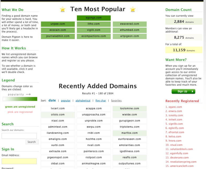
Homepage before:
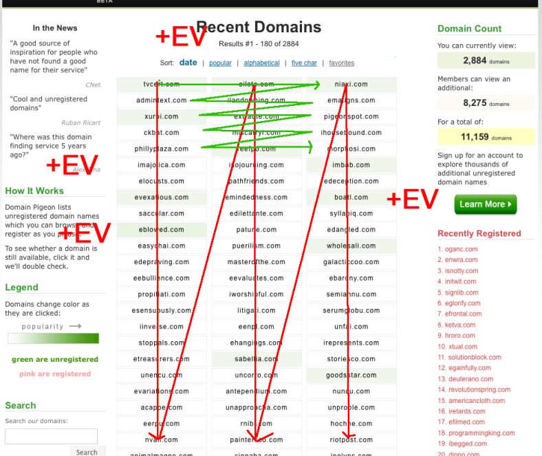
Homepage After (with markups):
- Previously, the domains were added onto the list vertically. So, for example, if you searched for “ninja” and it returned six names, all six would appear in the first column, one after the other. With six, it doesn’t look so bad, but sometimes it spills over into the second column. You might have the first column filled with 60 names, the second with 5, and the third with zero. It looked bad and it was especially hard to tell with the recently added names which were the most recent. Now, the domains are added horizontally, so that the second domain appears in Row 1, Column 2, the third in Row 1, Column 3, the fourth in Row 2, Column 1, etc.
- Combined the Who we Are and How it Works sections. Too much extra info, plus “headache” is not a word you should include on the homepage, even if you’re saying you’re the cure.
- Added In the News. Domain Pigeon has received a bit of attention the last several days and I’m seizing the opportunity to promote the site (+EV). CNet is at the top, as it is the the source with the most name recognition. After that is a short quote from Ruban Ricart of Frusketing.com and Alex Pina via Twitter. I considered putting “Frusketing” instead of Ruban Ricart and “Twitter” instead of Alex Pina, but it seemed dishonest to imply that Twitter, the company, had made the comment. I didn’t include Frusketing because it looks too much like Frustrating which is opposite of the impression (similar to omitting the word “headache”). Ryan’s article was kind of hard to pull a good quote directly from so I started off by doing some clever parsing (like “Domain Pigeon [..] is a [..] great site”), but it also seemed too dishonest (-EV) so I just went with something short and sweet.
- Removed Top 10 Domains. Simply put, they weren’t going anywhere. Unpee.com had been in the Top 10 for the past two days probably more because it was funny than because it was a good domain name. The Top 10 was important when the site wasn’t getting much traffic because it was a quick overview of what other visitors were doing and it was colorful, but now that the coloring algorithm has been adjusted and the site is getting more traffic, its not as important. Also, the two inches of white space below that section (which kept the dropdowns smooth), no longer has to be there. That’s valuable real estate and it was being wasted.
- Removed Want more? Too much no valued added fluff. I took the important parts (“You should sign up”) and added it to the bottom of the Domain Count section.
- Removed the Sign Up button and replaced it with Learn More. The words “Learn More” are a lot more inviting than “Sign Up”, aren’t they? Also, I doubled its size to encourage people to proceed to the registration page (+EV).
- The paragraphs on the side columns are now Verdana instead of the Lucille Sans or whatever it was before. It’s a nice contrast, though I’m slightly worried about branding.
- Renamed Recently Added Domains to Recent Domains — again, the more white space the better.
- When you search for a domain using the .com Checker you now have the option of quickly registering it using one of the affiliate links (+EV).
I also did a lot of work on the registration page, as it was not exactly something to be proud of.
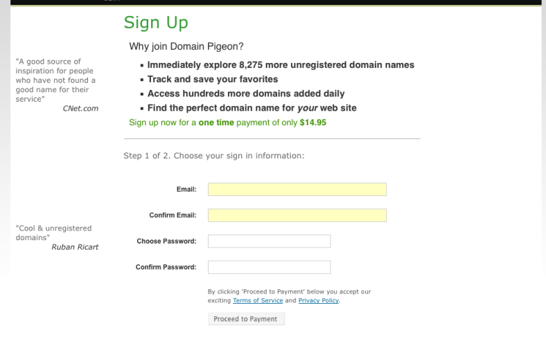
Registration Page Before:
This is almost identical to how it looked on the launch day with the exception of the quotes and some minor wording changes which I did yesterday.
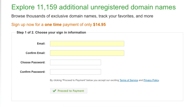
Registration Page After:
The major problem was that I was trying to fit everything within the center column without using either of the side columns. This forced me to use unnatural, awkward wording.
Expanding it so that I used the entire page allowed for a lot of extra flexibility. WordPress’s registration page was my inspiration for the current look. Also, that little button is thanks to an excellent tutorial by Kevin Hale on how to take advantage of the neglected <button> element.
It’s impossible to say how these small changes would have ffected the registration rate the past few days, but I think its fair to say that it only could have helped.
As always, if you have any suggestions for Domain Pigeon please don’t hestitate to email me at matthew.h.mazur@gmail.com.


