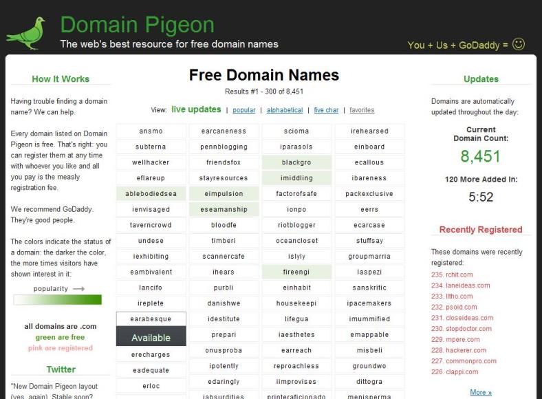
It just wasn’t right before and I couldn’t put my finger on it until today: there was no contrast between the white content and the light gray outside area. All my attempts to make the colors soothing had created this big gray amorphous blob. By using the off-black color, it really helps the content stand out.
Few other changes:
Frequency: 120 domains every 3 hours, or 960 domains/day instead of 60 every 60 minutes (1440/day). Originally I had planned on doing 1/minute, but the more I saw it in action the more it didn’t seem viable. By pushing all the recent domain names off the front page quickly it minimized the variety of colors on the homepage. 90% of the time it was entirely white. By reducing how often the domains are added it will help preserve some of the previous visitor’s browsing history. It’s also less crazy.
Go GoDaddy: The dropdown boxes now have only links to GoDaddy. They’re my best performing affiliate, I like their service (I use them to manage my domain names), and their support is fantastic. Also, more selection may have actually been detrimental to click through rates of new users.
Hover vs Click: No more clicking on the homepage domains. All you have to do is hover and it’ll take care of the drop down for you. Why the change? Again, more color. The downside: the domain name verification with Verisign is no longer visible; it all takes place in the background. The dropdown reflects the status of the domain when the page was last loaded. This actually doesn’t matter too much because 99% of the time available domain names are going to result in an available status from the WHOIS server.
Other things that changed: the wording on the left column (again) and the You+Me… moved to the top, as it was just out of place on the side.
The rounded corners on the content area are courtesy of roundedcornr.com, which automates the whole process.
Getting there…

