Visualizing the Sampling Distribution of a Proportion with R

In yesterday’s post, we showed that a binomial distribution can be approximated by a normal distribution and some of the math behind it.

Today we’ll take it a step further, showing how those results can help us understand the distribution of a sample proportion.

Consider the following example:

Out of the last 250 visitors to your website, 40 signed up for an account.

The conversion rate for that group is 16%, but it’s possible (and likely!) that the true conversion rate differs from this. Statistics can help us determine a range (a confidence interval) for what the true conversion rate actually is.

Recall that in the last post we said that the mean of the binomial distribution can be approximated with a normal distribution with a mean and standard deviation calculated by:

\mu = np

\sigma = \sqrt{npq}

For a proportion, we want to figure out the mean and standard deviation on a per-trial basis so we divide each formula by n, the number of trials:

\mu = \frac{np}{n} = p

\sigma = \frac{\sqrt{npq}}{n} = \sqrt{\frac{npq}{n^2}} = \sqrt{\frac{pq}{n}}

With the mean and standard deviation of the sample proportion in hand, we can plot the distribution for this example:

sample-proportion-distribution

As you can see, the most likely conversion rate is 16% (which is no surprise), but the true conversion rate can fall anywhere under that curve with it being less and less likely as you move farther away.

Where it gets really interesting is when you want to compare multiple proportions.

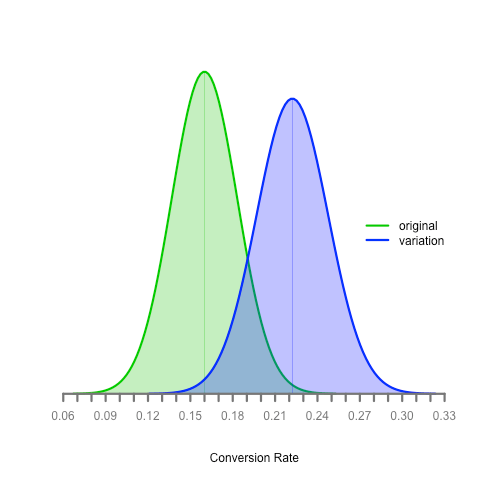
Let’s say we’re running an A/B test and the original had 40 conversions out of 250 like the example above and the experimental version had 60 conversions out of 270 participants. We can plot the distribution of both sample proportions with this code:


setClass(
Class = "Distribution",
representation = representation(
name = "character",
participants = "numeric",
conversions = "numeric",
sample_proportion = "numeric",
se = "numeric",
color = "character",
x = "vector",
y = "vector"
)
)
# We rewrite the initialize method for Distribution objects so that we can
# set the x and y values which are used throughout the plotting process
setMethod(
f = "initialize",
signature = "Distribution",
definition = function( .Object, name, participants, conversions, color ) {
.Object@name = name
.Object@sample_proportion = conversions / participants
.Object@se = sqrt( ( .Object@sample_proportion * ( 1 .Object@sample_proportion ) ) / participants )
.Object@color = color
.Object@x = seq( 4, 4, length = 100 ) * .Object@se + .Object@sample_proportion
.Object@y = dnorm( .Object@x, .Object@sample_proportion, .Object@se )
return ( .Object )
}
)
# Given a list of distributions, this returns a list of the x and y axis range
get_axis_ranges = function( distributions ) {
x_all = vector()
y_all = vector()
for ( distribution in distributions ) {
x_all = c( x_all, distribution@x )
y_all = c( y_all, distribution@y )
}
xlim = c( min( x_all ), max( x_all ) )
ylim = c( min( y_all ), max( y_all ) )
# Note that by forming a list of the vectors, the vectors get converted to lists
# which we then have to convert back to vectors in order to use them for plotting
return ( list( xlim, ylim ) )
}
get_x_axis_values = function( x_range ) {
by = 0.01
min_x = floor( min( x_range ) / by ) * by
max_x = ceiling( max( x_range ) / by ) * by
return ( seq( min_x, max_x, by = by ) )
}
# Define the distributions that we want to plot
distributions = list(
new( Class = "Distribution", name = "original", participants = 250, conversions = 40, color = "#00cc00" ),
new( Class = "Distribution", name = "variation", participants = 270, conversions = 60, color = "blue" )
)
# Determine the range to use for each axis
axis_range = get_axis_ranges( distributions )
xlim = axis_range[[ 1 ]]
ylim = axis_range[[ 2 ]]
# Create the plot
plot( NULL, NULL, type = "n", xlim = xlim, ylim = ylim, xlab = "Conversion Rate", ylab = "", main = "", axes = FALSE )
# Render each of the curves
line_width = 3
for ( distribution in distributions ) {
polygon( distribution@x, distribution@y, col = adjustcolor( distribution@color, alpha.f = 0.3 ), border = NA )
lines( distribution@x, distribution@y, col = adjustcolor( distribution@color, alpha.f = 1 ), lwd = line_width )
# Draw a line down the center of the curve
ci_center_y = dnorm( distribution@sample_proportion, distribution@sample_proportion, distribution@se )
coords = xy.coords( c( distribution@sample_proportion, distribution@sample_proportion ), c( 0, ci_center_y ) )
lines( coords, col = adjustcolor( distribution@color, alpha.f = 0.4 ), lwd = 1 )
}
# Render the x axis
axis( side = 1, at = get_x_axis_values( xlim ), pos = 0, col = "#777777", col.axis = "#777777", lwd = line_width )
# Finally, render a legend
legend_text = vector()
legend_colors = vector()
for ( distribution in distributions ) {
legend_text = c( legend_text, distribution@name )
legend_colors = c( legend_colors, distribution@color )
}
legend('right', legend_text, lty = 1, lwd = line_width, col = legend_colors, bty = 'n' )

Here’s the result:

multiple-sample-proportion-distribution

What can we determine from this? Is the experimental version better than the original? What if the true proportion for the original is 20% (towards the upper end of its distribution) and the true proportion for the experimental version is 16% (towards the lower end of its distribution)?

We’ll save the answer for a future post :)

Visualizing How a Normal Distribution Approximates a Binomial Distribution with R

My handy Elementary Statistics textbook, which I’m using to get smart on the math behind A/B testing, states the following:

Normal Distribution as Approximation to Binomial Distribution

If np \geq 5 and nq \geq 5, then the binomial random variable has a probability distribution that can be approximated by a normal distribution with the mean and standard deviation given as:

\mu = np

\sigma = \sqrt{npq}

In easier to understand terms, take the following example:

Each visitor to your website has a 30% chance of signing up for an account. Over the next 250 visitors, how many can you expect to sign up for an account?

The first formula lets us figure out the mean by simply multiplying the number of visitors by the probability of a successful conversion:

\mu = np = 250 * 0.30 = 75

Simple enough and fairly easy to understand.

The second formula, the one to figure out the standard deviation, is less intuitive:

\sigma = \sqrt{npq} = \sqrt{250 * 0.30 * (1 - 0.30)} = 7.25

Why are we taking the square root of the product of these three values? The textbook doesn’t explain, noting that “the formal justification that allows us to use the normal distribution as an approximation to the binomial distribution results from more advanced mathematics”.

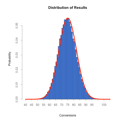
Because this standard deviation formula plays a big role in calculating the confidence intervals for sample proportions, I decided to simulate the scenario above to prove to myself that the standard deviation formula is accurate.

The R script below simulates 250 visitors coming to a website, each with a 30% chance of signing up. After each group of 250 visitors we track how many of them wound up converting. After all of the runs (the default is 1,000, though the higher the number the more accurate the distribution will be) we plot the probability distribution of the results in blue and a curve representing what we’d expect the distribution to look like if the standard deviation formula above is correct in red.


experiments = 1000
visitors = 250
conversion_rate = 0.3
expected_conversions = visitors * conversion_rate
expected_sd = sqrt( visitors * conversion_rate * ( 1 conversion_rate ) )
sd_for_axis_range = 4.5
axis_divisions = 5
results = vector()
for ( experiment in 1:experiments ) {
conversions = 0
for ( visitor in 1:visitors ) {
if ( runif( 1 ) <= conversion_rate ) {
conversions = conversions + 1
}
}
results = c( results, conversions )
}
par( oma = c( 0, 2, 0, 0 ) )
axis_min = floor( ( expected_conversions sd_for_axis_range * expected_sd ) / axis_divisions ) * axis_divisions
axis_max = ceiling( ( expected_conversions + sd_for_axis_range * expected_sd ) / axis_divisions ) * axis_divisions
hist( results, axes = FALSE, breaks = seq( axis_min, axis_max, by = 1 ), ylab = 'Probability', xlab = 'Conversions', freq = FALSE, col = '#4B85ED', main = 'Distribution of Results' )
axis( side = 1, at = seq( axis_min, axis_max, by = axis_divisions ), pos = 0, col = "#666666", col.axis = "#666666", lwd = 1, tck = 0.015 )
axis( side = 2, col = "#666666", col.axis = "#666666", lwd = 1, tck = 0.015 )
curve( dnorm(x, mean = conversion_rate * visitors, sd = expected_sd ), add = TRUE, col = "red", lwd = 4 )

view raw

normal-dist.r

hosted with ❤ by GitHub

The distribution of results from this experiment paints a telling picture:

normal-distribution

Not only is the mean what we expect (around 75), but the standard deviation formula (which said it would be 7.25) does predict the standard deviation from this experiment (7.25). Go figure :)

As we’ll see, we can use the fact that the normal distribution approximates a binomial distribution approximates to figure out the distribution of a sample proportion, which we can then compare to other sample proportion distributions to make conclusions about whether they differ and by how much (ie, how to analyze the results of an A/B test).

Rendering Two Normal Distribution Curves on a Single Plot with R

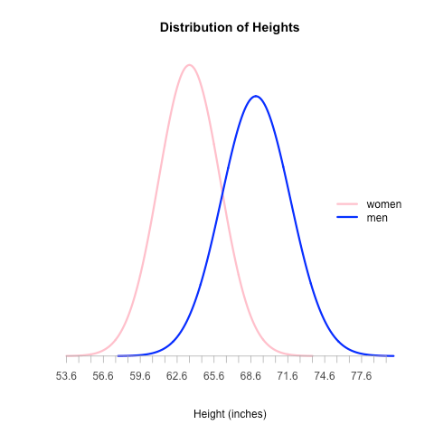
As a follow-up to my last post about how to render a normal distribution curve with R, here’s how you can render two on the same plot:

two-curves

setClass(
	Class = "Distribution",
	representation = representation(
		name = "character",
		mean = "numeric",
		sd = "numeric",
		color = "character",
		x = "vector",
		y = "vector"
	)
)

# We rewrite the initialize method for Distribution objects so that we can
# set the x and y values which are used throughout the plotting process
setMethod(
	f = "initialize",
	signature = "Distribution",
	definition = function( .Object, name, mean, sd, color ) {
		.Object@name = name
		.Object@mean = mean
		.Object@sd = sd
		.Object@color = color
		.Object@x = seq( -4, 4, length = 1000 ) * sd + mean
		.Object@y = dnorm( .Object@x, mean, sd )

		return ( .Object )
	}
)

# Given a list of distributions, this returns a list of the x and y axis range
get_axis_ranges = function( distributions ) {
	x_all = vector()
	y_all = vector()

	for ( distribution in distributions ) {
		x_all = c( x_all, distribution@x )
		y_all = c( y_all, distribution@y )
	}

	xlim = c( min( x_all ), max( x_all ) )
	ylim = c( min( y_all ), max( y_all ) )

	# Note that by forming a list of the vectors, the vectors get converted to lists
	# which we then have to convert back to vectors in order to use them for plotting
	return ( list( xlim, ylim ) )
}

# Define the distributions that we want to plot
distributions = list(
	new( Class = "Distribution", name = "women", mean = 63.6, sd = 2.5, color = "pink" ),
	new( Class = "Distribution", name = "men", mean = 69, sd = 2.8, color = "blue" )
)

# Determine the range to use for each axis
axis_range = get_axis_ranges( distributions )
xlim = unlist( axis_range[ 1 ] )
ylim = unlist( axis_range[ 2 ] )

# Create the plot
plot( NULL, NULL, type = "n", xlim = xlim, ylim = ylim, xlab = "Height (inches)", ylab = "", main = "Distribution of Heights", axes = FALSE )

# Render each of the curves
line_width = 3
for( distribution in distributions ) {
	lines( distribution@x, distribution@y, col = distribution@color, lwd = line_width )
}

# Render the x axis
axis_bounds <- seq( min( xlim ), max( xlim ) )
axis( side = 1, at = axis_bounds, pos = 0, col = "#aaaaaa", col.axis = "#444444" )

# Finally, render a legend
legend_text = vector()
legend_colors = vector()
for ( distribution in distributions ) {
	legend_text = c( legend_text, distribution@name )
	legend_colors = c( legend_colors, distribution@color )
}
legend('right', legend_text, lty = 1, lwd = line_width, col = legend_colors, bty = 'n' )

Plotting a Normal Distribution with R

I’ve been tinkering around with R for learning more about the math behind A/B testing and figured I’d share some of the work as I go.

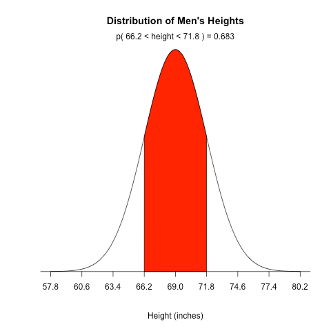
The website Stat Methods has an example showing how to plot a normal distribution for IQ scores, but as a beginner I found it hard to follow so I wound up re-writing it with comments, better variable names, and improved spacing. Also, instead of plotting IQ, I chose to plot men’s heights.

Here’s the final result:

heights

And here’s the code:

# Men's heights are normally distributed with a population mean of 69.0 inches
# and a population standard deviation of 2.8 inches

population_mean <- 69
population_sd <- 2.8
sd_to_fill <- 1
lower_bound <- population_mean - population_sd * sd_to_fill
upper_bound <- population_mean + population_sd * sd_to_fill

# Generates equally spaced values within 4 standard deviations of the mean
# This is used to connect the points on the curve so the more points the better
x <- seq(-4, 4, length = 1000) * population_sd + population_mean

# Returns the height of the probably distribution at each of those points
y <- dnorm(x, population_mean, population_sd)

# Generate the plot, where:
# - type: the type of plot to be drawn where "n" means do not plot the points
# - xlab: the title of the x axis
# - ylab: the title of the y axis
# - main: the overall title for the plot
# - axes: when false it suppresses the axis automatically generated by the high level plotting function so that we can create custom axis
plot(x, y, type="n", xlab = "Height (inches)", ylab = "", main = "Distribution of Men's Heights", axes = FALSE)

# Connect all of the points with each other to form the bell curve
lines(x, y)

# Returns a vector of boolean values representing whether the x value is between the two bounds then
# filters the values so that only the ones within the bounds are returned
bounds_filter <- x >= lower_bound & x <= upper_bound
x_within_bounds <- x[bounds_filter]
y_within_bounds <- y[bounds_filter]

# We want the filled in area to extend all the way down to the y axis which is why these two lines are necessary
# It makes the first point in the polygon (lower_bound, 0) and the last point (upper_bound, 0)
x_polygon <- c(lower_bound, x_within_bounds, upper_bound)
y_polygon <- c(0, y_within_bounds, 0)

polygon(x_polygon, y_polygon, col = "red")

# Now determine the probability that someone falls between the two bounds so we can display it above the curve
# Remember that pnorm returns the probability that a normally distributed random number will be less than the given number
probability_within_bounds <- pnorm(upper_bound, population_mean, sd) - pnorm(lower_bound, population_mean, population_sd)

# Concatenate the various values so we can display it on the curve
text <- paste("p(", lower_bound, "< height <", upper_bound, ") =", signif(probability_within_bounds, digits = 3))

# Display the text on the plot. The default "side" parameter is 3, representing the top of the plot.
mtext(text)

# Add an axis to the current plot, where:
# - side: which side of the plot the axis should be drawn on where 1 represents the bottom
# - at: the points at which the tick-marks are to be drawn
# - pos: the coordinate at which the axis line is to be drawn
sd_axis_bounds = 5
axis_bounds <- seq(-sd_axis_bounds * population_sd + population_mean, sd_axis_bounds * population_sd + population_mean, by = population_sd)
axis(side = 1, at = axis_bounds, pos = 0)

If you’re experienced with R and have any suggestions on how to improve this code, just let me know.

More to follow soon.