My handy Elementary Statistics textbook, which I’m using to get smart on the math behind A/B testing, states the following:
Normal Distribution as Approximation to Binomial Distribution
If
and
, then the binomial random variable has a probability distribution that can be approximated by a normal distribution with the mean and standard deviation given as:
In easier to understand terms, take the following example:
Each visitor to your website has a 30% chance of signing up for an account. Over the next 250 visitors, how many can you expect to sign up for an account?
The first formula lets us figure out the mean by simply multiplying the number of visitors by the probability of a successful conversion:
Simple enough and fairly easy to understand.
The second formula, the one to figure out the standard deviation, is less intuitive:
Why are we taking the square root of the product of these three values? The textbook doesn’t explain, noting that “the formal justification that allows us to use the normal distribution as an approximation to the binomial distribution results from more advanced mathematics”.
Because this standard deviation formula plays a big role in calculating the confidence intervals for sample proportions, I decided to simulate the scenario above to prove to myself that the standard deviation formula is accurate.
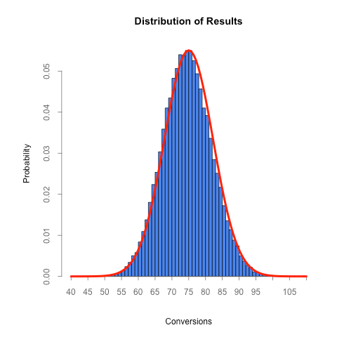
The R script below simulates 250 visitors coming to a website, each with a 30% chance of signing up. After each group of 250 visitors we track how many of them wound up converting. After all of the runs (the default is 1,000, though the higher the number the more accurate the distribution will be) we plot the probability distribution of the results in blue and a curve representing what we’d expect the distribution to look like if the standard deviation formula above is correct in red.
This file contains hidden or bidirectional Unicode text that may be interpreted or compiled differently than what appears below. To review, open the file in an editor that reveals hidden Unicode characters.
Learn more about bidirectional Unicode characters
| experiments = 1000 | |
| visitors = 250 | |
| conversion_rate = 0.3 | |
| expected_conversions = visitors * conversion_rate | |
| expected_sd = sqrt( visitors * conversion_rate * ( 1 – conversion_rate ) ) | |
| sd_for_axis_range = 4.5 | |
| axis_divisions = 5 | |
| results = vector() | |
| for ( experiment in 1:experiments ) { | |
| conversions = 0 | |
| for ( visitor in 1:visitors ) { | |
| if ( runif( 1 ) <= conversion_rate ) { | |
| conversions = conversions + 1 | |
| } | |
| } | |
| results = c( results, conversions ) | |
| } | |
| par( oma = c( 0, 2, 0, 0 ) ) | |
| axis_min = floor( ( expected_conversions – sd_for_axis_range * expected_sd ) / axis_divisions ) * axis_divisions | |
| axis_max = ceiling( ( expected_conversions + sd_for_axis_range * expected_sd ) / axis_divisions ) * axis_divisions | |
| hist( results, axes = FALSE, breaks = seq( axis_min, axis_max, by = 1 ), ylab = 'Probability', xlab = 'Conversions', freq = FALSE, col = '#4B85ED', main = 'Distribution of Results' ) | |
| axis( side = 1, at = seq( axis_min, axis_max, by = axis_divisions ), pos = 0, col = "#666666", col.axis = "#666666", lwd = 1, tck = -0.015 ) | |
| axis( side = 2, col = "#666666", col.axis = "#666666", lwd = 1, tck = -0.015 ) | |
| curve( dnorm(x, mean = conversion_rate * visitors, sd = expected_sd ), add = TRUE, col = "red", lwd = 4 ) |
The distribution of results from this experiment paints a telling picture:
Not only is the mean what we expect (around 75), but the standard deviation formula (which said it would be 7.25) does predict the standard deviation from this experiment (7.25). Go figure :)
As we’ll see, we can use the fact that the normal distribution approximates a binomial distribution approximates to figure out the distribution of a sample proportion, which we can then compare to other sample proportion distributions to make conclusions about whether they differ and by how much (ie, how to analyze the results of an A/B test).


Hi this is an excellent demo and very useful to understand the binomial distribution and how it leads to normal distribution as the number experiments increase. What i am not clear is the reason for generating the conversions from uniform distribution (runif(1)). Could you please explain a bit on this ?
Regards,
Jagan
Good question. runif(1) generates a random number between 0 and 1. By using it, I’m simulating that a single visitor converts (when runif(1) is less than the conversion rate).