The Road Forward

Last week was amazing.

The post-launch press from CNet and ReadWriteWeb was both unexpected and exhilarating.  Prior to launch there was a big question mark hovering over the project: Would people like it? Would people pay for it? Would it be secure? I’m happy to say that the answers seem to be yes, yes, and yes.

I’m cautiously optimistic looking forward.  Its a great start, no doubt, but its just that: a start. It’s no time to be complacent; the site needs a lot of work in order to prosper in the coming weeks and months. I’ve got no shortage of ideas to make that happen, only a shortage of time to implement them.

Before I start adding more features I’m going to add credit card processing to the site. The percentage of people that follow through to Paypal to complete their registration is abysmal. That might be because its not clear that it costs money–though I think it is–or it could be because people don’t like using Paypal for whatever reason. I need to give people the option to do it on Domain Pigeon or I’m going to constantly wonder just how much of an impact its having on the revenue.

Adding credit card processing is tedious and I honestly can’t wait till its implemented so I can get back to adding features. When I program, I tend just to hack away and then fix things as they break. Unfortunately, I don’t have that luxury while handling credit card information. I won’t be comfortable with it unless its meticulously planned and tested prior to deployment. And that, I’m sorry to say, is going to keep me busy for the next few nights.

Homepage Updates

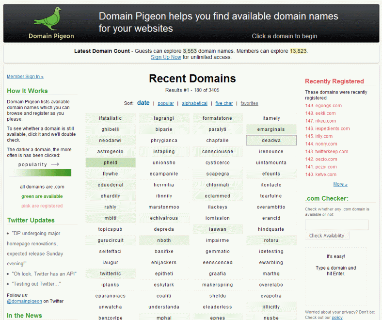
Yesterday:

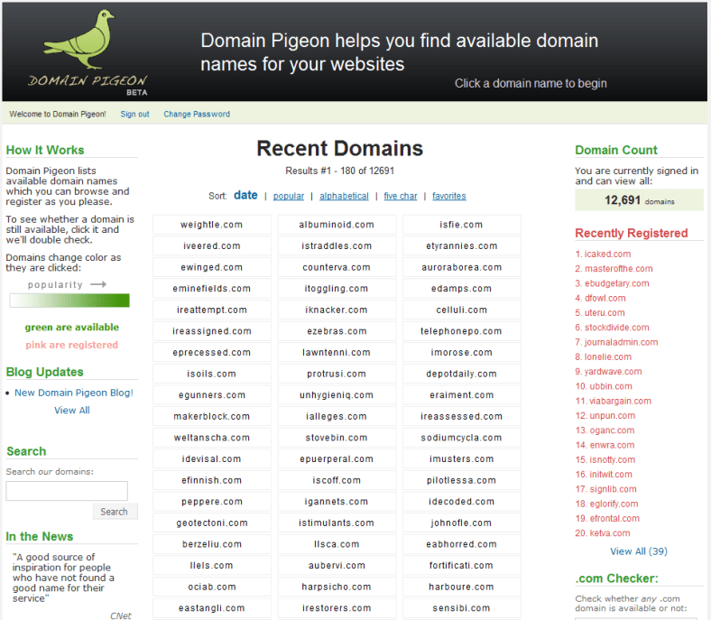
Today:

Notable changes:

  • Header – The new header is a bit smaller than the old one. This was done to get more information onto the homepage’s initial viewing area.
  • Logo – The new logo is smaller and brighter than the old one, hopefully conveying a cleaner, more professional look
  • Rounded corners – The header, the domain count, and the main content area now all have rounded corners. Apple’s homepage was the inspiration for this change. It’s such a small thing, but it looks so much better.
  • Domain columns – The site now omits “.com” after all the domain names because it added clutter and not much value. I’m slightly worried that some newcomers won’t understand what the domains are without the “.com” to clarify it so I added a small line below the popularity legend saying “all domains are .com” which will hopefully eliminate any confusion. With the extra space I was able to include a valuable fourth column. Also, before when a customer hovered over one of the domains its border would turn black. Now it is a dark gray, which is nicer on the eyes.
  • Twitter – I registered @domainpigeon in November while I was working on the site but wasn’t sure what role it was going to play. Now, instead of links to blog posts, the homepage will have Twitter updates. The blog will be reserved for lengthy posts, which, at this point, I don’t see happening too frequently.
  • Sign In Area – This was a tough one. I liked it on the homepage, but there’s wasn’t a good way to integrate it. Now, I just added a link to a seperate page that lets you sign in. I figure cookies will keep most customers signed in anyway, so its not that important to have it on the homepage. I do think that having it ont he homepage encourages more people to sign up though, so, its definitely a tradeoff.
  • In the News – You can’t see it here, but I added a great quote from the ReadWriteWeb article on there. I also moved most of the quotes to a separate page in an effort to preserve white space. Currently, the ReadWriteWeb and the CNet quotes are the only ones included on the homepage.
  • Registered Domain Names – Before, the top domain in this list was #1, but its actually the last domain that was registered, so I changed the numbering.
  • The domain count was moved up to the top. Also got rid of “Members can view an additional” as it’s unnecessary information. The total is fine. I think this looks a lot more professional than the way it was done before. This also frees up space on the right column. Notice the juxtaposition of the word “explore” and “Sign Up”.
  • The title went from “Domain Pigeon – You’re #1 Source for Available Domain Names” to “Domain Pigeon – Available Domain Names”. I think this could still use some improvement, but I like it better than the former one, which came off as tacky.
  • Link Usability – I noticed there was inconsistent use of underlines for the links on the homepage. They should all be standardized now.
  • Registered domain names no longer appear along side the registered ones. This is because the 75% of the popular page was littered with pink domains, defeating its purpose.
  • The primary font for the side columns is Lucida Grande. No more Verdana, ever.
  • Added “Register.com” as one of the affiliates, per the request of a customer.
  • Redid a lot of the CSS – I was kind of learning the intracicies of CSS as I went and now am able to go back and clean up a lot of it. There’s a lot less “float: lefts” in there now…

I’m very happy with these changes and think the site looks much better now.

Tomorrow I’m going to focus on cleaning up some of the code, writing more tests, and learning how to integrate credit card processing into the site.

Wow

From ReadWriteWeb

You’ve done the market research. You’ve built the killer app. Now, all you need is a decent domain name. Preferably a .com. Why? Because the iPhone doesn’t have a .net button, for one thing. But finding something short and memorable can be difficult at best. Enter Domain Pigeon, a domain search service that eschews one-at-a-time searches by allowing you to thumb through a laundry list of available domains – including the five-letter .com domains that are still available.

We’ve used a number of domain name searches, and Domain Pigeon’s approach is among the best we’ve seen. It’s simple and straightforward. Best of all, you get to see extensive lists of available domains all at once. But there’s one catch: you can’t buy a domain there.

Ironically, it’s the fact that you can’t buy domain names that makes Domain Pigeon so nice to use. Traditional domain services actually restrict your ability to research names by showing you a few domains at a time based on your searches. Why? For a very simple reason: once you search and find a domain, you’re more likely to buy one for fear of losing it.

But because Domain Pigeon is passing you through to another service – and picking up an affiliate kickback – there’s no harm in showing you everything at once. You get the freedom to look at a wide variety of domains and, should you decide to buy, Domain Pigeon still sees revenue. Win, win.

domainpigeonscreen.jpgBut don’t think all of the pressure is off. Domain Pigeon still does a nice job of motivating you to purchase by showing you how many other people are currently interested in that domain name. For example, 16 people are currently interested in purchasing illpe.com, so if you were building illpe, you might want to hurry.

The next time you’re still looking for that perfect domain name, try Domain Pigeon. At the very least, it will spark some ideas. At best, you may walk away with the perfect – albeit unintelligible – .com name for your new venture.

We’re looking forward to reviewing reakd, tchdo, ofgar, ainxx, and rpayi in the not too distant future.

Ugly

Domain Pigeon, as it currently stands, is ugly.

My standard is this: Imagine standing by while someone whose opinion you hold in extremely high regards meticulously reviews your work.  If you can imagine yourself standing there confidently without worrying about what what he or she will find, you’ve probably got a great product. If, on the other hand, you imagine yourself thinking up excuses for why your product is not up to par, then you’ve probably got work left to do.

In Domain Pigeon’s case, I imagine myself saying “Well, I only launched it a week ago. Here’s what I’ve got planned for the future…” Instead, I want to say, “Look here, this is what I’ve accomplished.

ECD: Sunday