Removing Gaps from Stacked Area Charts in R

Creating a stacked area chart in R is fairly painless, unless your data has gaps. For example, consider the following CSV data showing the number of plan signups per week:


+————+———-+———+
| week | plan | signups |
+————+———-+———+
| 2017-01-26 | Bronze | 10 |
| 2017-01-26 | Gold | 55 |
| 2017-01-26 | Standard | 108 |
| 2017-02-05 | Bronze | 6 |
| 2017-02-05 | Iron | 1 |
| 2017-02-05 | Gold | 37 |
| 2017-02-05 | Standard | 142 |
| 2017-02-12 | Bronze | 17 |
| 2017-02-12 | Iron | 2 |
| 2017-02-12 | Gold | 42 |
| 2017-02-12 | Standard | 119 |
| 2017-02-19 | Bronze | 11 |
| 2017-02-19 | Gold | 26 |
| 2017-02-19 | Silver | 4 |
| 2017-02-19 | Platinum | 1 |
| 2017-02-19 | Standard | 70 |
| 2017-02-26 | Bronze | 13 |
| 2017-02-26 | Silver | 5 |
| 2017-02-26 | Standard | 52 |
+————+———-+———+

Plotting this highlights the problem:


library(ggplot2)
data <- read.csv("dummy-data.csv", sep = "\t")
g <- ggplot(data, aes(x = week, y = signups, group = plan, fill = plan)) +
geom_area()
print(g)

chart.png

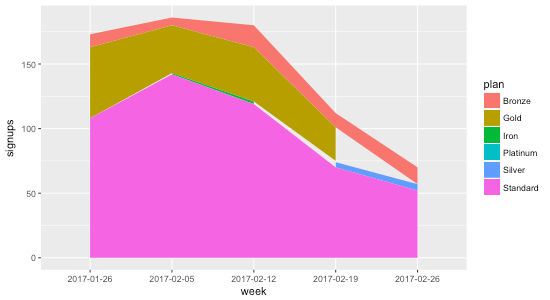
The reason the gaps exist is that not all plans have data points every week. Consider Gold, for example: during the first four weeks there are 55, 37, 42, and 26 signups, but during the last week there isn’t a data point at all. That’s why the chart shows the gap: it’s not that the data indicates Gold went to zero signups the final week; it indicates no data at all.

To remedy this, we need to ensure that every week contains a data point for every plan. That means for weeks where there isn’t a data point for a plan, we need to fill it in with 0 so that R knows that the signups are in fact 0 for that week.

I asked Charles Bordet, an R expert who I hired through Upwork to help me level up my R skills, how he would go about filling in the data.

He provided two solutions:

1. Using expand.grid and full_join


data <- read.csv("data.csv", sep = "\t")
weeks <- unique(data$week)
plans <- unique(data$plan)
combinations <- expand.grid(week = weeks, plan = plans)
data <- full_join(data, combinations, by = c("week" = "week", "plan" = "plan")) %>%
mutate(signups = ifelse(is.na(signups), 0, signups)) %>%
arrange(week, plan)
g <- ggplot(data, aes(x = week, y = signups, group = plan, fill = plan)) +
geom_area(position = "stack")
print(g)

Here’s how it works:

expand.grid creates “a data frame from all combinations of the supplied vectors or factors”. By passing it in the weeks and plans, it generates the following data frame called combinations:


week plan
1 2017-01-26 Bronze
2 2017-02-05 Bronze
3 2017-02-12 Bronze
4 2017-02-19 Bronze
5 2017-02-26 Bronze
6 2017-01-26 Gold
7 2017-02-05 Gold
8 2017-02-12 Gold
9 2017-02-19 Gold
10 2017-02-26 Gold
11 2017-01-26 Standard
12 2017-02-05 Standard
13 2017-02-12 Standard
14 2017-02-19 Standard
15 2017-02-26 Standard
16 2017-01-26 Iron
17 2017-02-05 Iron
18 2017-02-12 Iron
19 2017-02-19 Iron
20 2017-02-26 Iron
21 2017-01-26 Silver
22 2017-02-05 Silver
23 2017-02-12 Silver
24 2017-02-19 Silver
25 2017-02-26 Silver
26 2017-01-26 Platinum
27 2017-02-05 Platinum
28 2017-02-12 Platinum
29 2017-02-19 Platinum
30 2017-02-26 Platinum

The full_join then takes all of the rows from data and combines them with combinations based on week and plan. When there aren’t any matches (which will happen when a week doesn’t have a value for a plan), signups gets set to NA:


week plan signups
1 2017-01-26 Bronze 10
2 2017-01-26 Gold 55
3 2017-01-26 Standard 108
4 2017-02-05 Bronze 6
5 2017-02-05 Iron 1
6 2017-02-05 Gold 37
7 2017-02-05 Standard 142
8 2017-02-12 Bronze 17
9 2017-02-12 Iron 2
10 2017-02-12 Gold 42
11 2017-02-12 Standard 119
12 2017-02-19 Bronze 11
13 2017-02-19 Gold 26
14 2017-02-19 Silver 4
15 2017-02-19 Platinum 1
16 2017-02-19 Standard 70
17 2017-02-26 Bronze 13
18 2017-02-26 Silver 5
19 2017-02-26 Standard 52
20 2017-02-26 Gold NA
21 2017-01-26 Iron NA
22 2017-02-19 Iron NA
23 2017-02-26 Iron NA
24 2017-01-26 Silver NA
25 2017-02-05 Silver NA
26 2017-02-12 Silver NA
27 2017-01-26 Platinum NA
28 2017-02-05 Platinum NA
29 2017-02-12 Platinum NA
30 2017-02-26 Platinum NA

Then we just use dplyr’s mutate to replace all of the NA values with zero, and voila:


week plan signups
1 2017-01-26 Bronze 10
2 2017-01-26 Gold 55
3 2017-01-26 Iron 0
4 2017-01-26 Platinum 0
5 2017-01-26 Silver 0
6 2017-01-26 Standard 108
7 2017-02-05 Bronze 6
8 2017-02-05 Gold 37
9 2017-02-05 Iron 1
10 2017-02-05 Platinum 0
11 2017-02-05 Silver 0
12 2017-02-05 Standard 142
13 2017-02-12 Bronze 17
14 2017-02-12 Gold 42
15 2017-02-12 Iron 2
16 2017-02-12 Platinum 0
17 2017-02-12 Silver 0
18 2017-02-12 Standard 119
19 2017-02-19 Bronze 11
20 2017-02-19 Gold 26
21 2017-02-19 Iron 0
22 2017-02-19 Platinum 1
23 2017-02-19 Silver 4
24 2017-02-19 Standard 70
25 2017-02-26 Bronze 13
26 2017-02-26 Gold 0
27 2017-02-26 Iron 0
28 2017-02-26 Platinum 0
29 2017-02-26 Silver 5
30 2017-02-26 Standard 52

2. Using spread and gather

The second method Charles provided uses the tidyr package’s spread and gather functions:


data <- read.csv("data.csv", sep = "\t")
data <- data %>%
tidyr::spread(key = plan, value = signups, fill = 0) %>%
tidyr::gather(key = plan, value = signups, – week) %>%
arrange(week, plan)
g <- ggplot(data, aes(x = week, y = signups, group = plan, fill = plan)) +
geom_area(position = "stack")
print(g)

The spread function takes the key-value pairs (week and plan in this case) and spreads it across multiple columns, making the “long” data “wider”, and filling in the missing values with 0:


week Bronze Gold Iron Platinum Silver Standard
1 2017-01-26 10 55 0 0 0 108
2 2017-02-05 6 37 1 0 0 142
3 2017-02-12 17 42 2 0 0 119
4 2017-02-19 11 26 0 1 4 70
5 2017-02-26 13 0 0 0 5 52

view raw

spread-data.txt

hosted with ❤ by GitHub

Then we take the wide data and convert it back to long data using gather The - week means to exclude the week column when gathering the data that spread produced:


week plan signups
1 2017-01-26 Bronze 10
2 2017-01-26 Gold 55
3 2017-01-26 Iron 0
4 2017-01-26 Platinum 0
5 2017-01-26 Silver 0
6 2017-01-26 Standard 108
7 2017-02-05 Bronze 6
8 2017-02-05 Gold 37
9 2017-02-05 Iron 1
10 2017-02-05 Platinum 0
11 2017-02-05 Silver 0
12 2017-02-05 Standard 142
13 2017-02-12 Bronze 17
14 2017-02-12 Gold 42
15 2017-02-12 Iron 2
16 2017-02-12 Platinum 0
17 2017-02-12 Silver 0
18 2017-02-12 Standard 119
19 2017-02-19 Bronze 11
20 2017-02-19 Gold 26
21 2017-02-19 Iron 0
22 2017-02-19 Platinum 1
23 2017-02-19 Silver 4
24 2017-02-19 Standard 70
25 2017-02-26 Bronze 13
26 2017-02-26 Gold 0
27 2017-02-26 Iron 0
28 2017-02-26 Platinum 0
29 2017-02-26 Silver 5
30 2017-02-26 Standard 52

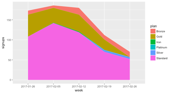
Using either methods, we get a stacked area chart without the gaps ⚡️:

chart.png

Exploring ranking techniques in MySQL

While trying to wrangle a MySQL query to rank a set of results, I got sucked into a few Stack Overflow threads outlining various approaches.

In order to understand the pros and cons of each technique, I created some test data and reimplemented the solutions, all of which I’ve shared below.

If there are any other methods worth including here, please drop a note in the comments.

We’ll be working with this table:

DROP TABLE IF EXISTS users;

CREATE TABLE users (user_id INT PRIMARY KEY AUTO_INCREMENT, name VARCHAR(20), start_date DATE, team_id INT);
INSERT INTO users (name, start_date, team_id) VALUES ('Matt', '2017-01-01', 1);
INSERT INTO users (name, start_date, team_id) VALUES ('John', '2017-01-02', 2);
INSERT INTO users (name, start_date, team_id) VALUES ('Sara', '2017-01-02', 2);
INSERT INTO users (name, start_date, team_id) VALUES ('Tim', '2017-01-02', 3);
INSERT INTO users (name, start_date, team_id) VALUES ('Bob', '2017-01-03', 3);
INSERT INTO users (name, start_date, team_id) VALUES ('Bill', '2017-01-04', 3);
INSERT INTO users (name, start_date, team_id) VALUES ('Kathy', '2017-01-04', 3);
INSERT INTO users (name, start_date, team_id) VALUES ('Anne', '2017-01-05', 3);
+---------+-------+------------+---------+
| user_id | name  | start_date | team_id |
+---------+-------+------------+---------+
|       1 | Matt  | 2017-01-01 |       1 |
|       2 | John  | 2017-01-02 |       2 |
|       3 | Sara  | 2017-01-02 |       2 |
|       4 | Tim   | 2017-01-02 |       3 |
|       5 | Bob   | 2017-01-03 |       3 |
|       6 | Bill  | 2017-01-04 |       3 |
|       7 | Kathy | 2017-01-04 |       3 |
|       8 | Anne  | 2017-01-05 |       3 |
+---------+-------+------------+---------+

Ranked by start date

SELECT *
FROM users
ORDER by start_date ASC

Ranked by start date with ties broken by user id

SELECT *
FROM users
ORDER by start_date ASC, user_id ASC

First employee by start date with ties broken by user id

SELECT *
FROM users
ORDER by start_date ASC, user_id ASC
LIMIT 1

First employee by start date with ties

SELECT *
FROM users
WHERE start_date = (SELECT MIN(start_date) FROM users);

Second employee by start date with ties broken by user id

SELECT *
FROM users
ORDER by start_date ASC, user_id ASC
LIMIT 1
OFFSET 1

Second employee by start date with ties

SELECT *
FROM users
WHERE start_date = (
    SELECT DISTINCT start_date
    FROM users
    ORDER BY start_date ASC
    LIMIT 1
    OFFSET 1
)

Ranked by start date using variable

SET @rank := 0;
SELECT
    *,
    @rank := @rank + 1 AS rank
FROM users
ORDER BY start_date ASC
+---------+-------+------------+---------+------+
| user_id | name  | start_date | team_id | rank |
+---------+-------+------------+---------+------+
|       1 | Matt  | 2017-01-01 |       1 |    1 |
|       2 | John  | 2017-01-02 |       2 |    2 |
|       3 | Sara  | 2017-01-02 |       2 |    3 |
|       4 | Tim   | 2017-01-02 |       3 |    4 |
|       5 | Bob   | 2017-01-03 |       3 |    5 |
|       6 | Bill  | 2017-01-04 |       3 |    6 |
|       7 | Kathy | 2017-01-04 |       3 |    7 |
|       8 | Anne  | 2017-01-05 |       3 |    8 |
+---------+-------+------------+---------+------+

Ranked by start date using a variable

Based on this Stack Overflow comment:

SELECT
    *,
    @rank := @rank + 1 AS rank
FROM users, (SELECT @rank := 0) r
ORDER BY start_date ASC
+---------+-------+------------+---------+------------+------+
| user_id | name  | start_date | team_id | @rank := 0 | rank |
+---------+-------+------------+---------+------------+------+
|       1 | Matt  | 2017-01-01 |       1 |          0 |    1 |
|       2 | John  | 2017-01-02 |       2 |          0 |    2 |
|       3 | Sara  | 2017-01-02 |       2 |          0 |    3 |
|       4 | Tim   | 2017-01-02 |       3 |          0 |    4 |
|       5 | Bob   | 2017-01-03 |       3 |          0 |    5 |
|       6 | Bill  | 2017-01-04 |       3 |          0 |    6 |
|       7 | Kathy | 2017-01-04 |       3 |          0 |    7 |
|       8 | Anne  | 2017-01-05 |       3 |          0 |    8 |
+---------+-------+------------+---------+------------+------+

First employee by start date using by setting a variable

SET @rank := 0;
SELECT *
FROM (
    SELECT
        *,
        @rank := @rank + 1 AS rank
    FROM users
    ORDER BY start_date ASC
) ranked
WHERE rank = 1

Ranked by start date with ties

Based on this Stack Overflow comment:

SET @prev_start_date = NULL;
SET @rank := 0;
SELECT
    *,
    CASE
        WHEN @prev_start_date = start_date THEN @rank
        -- Note that the assignment here will always be true
        WHEN @prev_start_date := start_date THEN @rank := @rank + 1
    END AS rank
FROM users
ORDER BY start_date ASC
+---------+-------+------------+---------+------+
| user_id | name  | start_date | team_id | rank |
+---------+-------+------------+---------+------+
|       1 | Matt  | 2017-01-01 |       1 |    1 |
|       2 | John  | 2017-01-02 |       2 |    2 |
|       3 | Sara  | 2017-01-02 |       2 |    2 |
|       4 | Tim   | 2017-01-02 |       3 |    2 |
|       5 | Bob   | 2017-01-03 |       3 |    3 |
|       6 | Bill  | 2017-01-04 |       3 |    4 |
|       7 | Kathy | 2017-01-04 |       3 |    4 |
|       8 | Anne  | 2017-01-05 |       3 |    5 |
+---------+-------+------------+---------+------+

Ranked by user id within each team

SELECT
    a.*,
    COUNT(*) AS rank
FROM users a
INNER JOIN users b
ON a.team_id = b.team_id AND a.user_id >= b.user_id
GROUP BY a.team_id, a.user_id

or, based on this Stack Overflow comment:

SELECT
    a.*,
    (
        SELECT COUNT(*)
        FROM users b
        WHERE a.team_id = b.team_id AND a.user_id >= b.user_id
    ) AS ranked
FROM users a
+---------+-------+------------+---------+--------+
| user_id | name  | start_date | team_id | ranked |
+---------+-------+------------+---------+--------+
|       1 | Matt  | 2017-01-01 |       1 |      1 |
|       2 | John  | 2017-01-02 |       2 |      1 |
|       3 | Sara  | 2017-01-02 |       2 |      2 |
|       4 | Tim   | 2017-01-02 |       3 |      1 |
|       5 | Bob   | 2017-01-03 |       3 |      2 |
|       6 | Bill  | 2017-01-04 |       3 |      3 |
|       7 | Kathy | 2017-01-04 |       3 |      4 |
|       8 | Anne  | 2017-01-05 |       3 |      5 |
+---------+-------+------------+---------+--------+

Note that both of these techniques require that there be a column without duplicates that we can rank on within the partition. For example, we can’t use start_date due to the duplicates within team 2 (2017-01-02) and team 3 (2017-01-14):

SELECT
    a.*,
    COUNT(*) AS rank
FROM users a
INNER JOIN users b
ON a.team_id = b.team_id AND a.start_date >= b.start_date
GROUP BY a.team_id, a.user_id
+---------+-------+------------+---------+------+
| user_id | name  | start_date | team_id | rank |
+---------+-------+------------+---------+------+
|       1 | Matt  | 2017-01-01 |       1 |    1 |
|       2 | John  | 2017-01-02 |       2 |    2 |
|       3 | Sara  | 2017-01-02 |       2 |    2 |
|       4 | Tim   | 2017-01-02 |       3 |    1 |
|       5 | Bob   | 2017-01-03 |       3 |    2 |
|       6 | Bill  | 2017-01-04 |       3 |    4 |
|       7 | Kathy | 2017-01-04 |       3 |    4 |
|       8 | Anne  | 2017-01-05 |       3 |    5 |
+---------+-------+------------+---------+------+

Return the last person to join within each team based on user id

Based on this Stack Overflow comment:

SELECT a.*
FROM users a
LEFT JOIN users b
ON a.team_id = b.team_id AND a.user_id < b.user_id
WHERE b.team_id IS NULL

or

SELECT a.*
FROM users a
WHERE user_id IN (
    SELECT MAX(user_id)
    FROM users
    GROUP BY team_id
)
+---------+------+------------+---------+
| user_id | name | start_date | team_id |
+---------+------+------------+---------+
|       1 | Matt | 2017-01-01 |       1 |
|       3 | Sara | 2017-01-02 |       2 |
|       8 | Anne | 2017-01-05 |       3 |
+---------+------+------------+---------+

Return the last people to join within each team based on start date

SELECT a.*
FROM users a
LEFT JOIN users b
ON a.team_id = b.team_id AND a.start_date < b.start_date
WHERE b.team_id IS NULL

or, based on this groupwise max post:

SELECT a.*
FROM users a
INNER JOIN (
    SELECT team_id, MAX(start_date) AS max_start_date
    FROM users b
    GROUP BY team_id
) max_start_dates
ON a.team_id = max_start_dates.team_id AND a.start_date = max_start_dates.max_start_date
+---------+------+------------+---------+
| user_id | name | start_date | team_id |
+---------+------+------------+---------+
|       1 | Matt | 2017-01-01 |       1 |
|       2 | John | 2017-01-02 |       2 |
|       3 | Sara | 2017-01-02 |       2 |
|       8 | Anne | 2017-01-05 |       3 |
+---------+------+------------+---------+

Ranked with gaps

Based on this Stack Overflow comment:

SELECT
    user_id,
    name,
    start_date,
    team_id,
    rank
FROM (
    SELECT
        *,
        IF(start_date = @_last_start_date, @cur_rank := @cur_rank, @cur_rank := @_sequence) AS rank,
        @_sequence := @_sequence + 1,
        @_last_start_date := start_date
    FROM users, (SELECT @cur_rank := 1, @_sequence := 1, @_last_start_date := NULL) r
    ORDER BY start_date
) ranked

Notice that after the three tied for second earliest start date, the next one jumps to 5 (not 3):

+---------+-------+------------+---------+------+
| user_id | name  | start_date | team_id | rank |
+---------+-------+------------+---------+------+
|       1 | Matt  | 2017-01-01 |       1 |    1 |
|       2 | John  | 2017-01-02 |       2 |    2 |
|       3 | Sara  | 2017-01-02 |       2 |    2 |
|       4 | Tim   | 2017-01-02 |       3 |    2 |
|       5 | Bob   | 2017-01-03 |       3 |    5 |
|       6 | Bill  | 2017-01-04 |       3 |    6 |
|       7 | Kathy | 2017-01-04 |       3 |    6 |
|       8 | Anne  | 2017-01-05 |       3 |    8 |
+---------+-------+------------+---------+------+

Technically this is known as the rank whereas the other examples, which didn’t include gaps, is the dense rank.

Happy ranking!

Implementing the Global Revenue chart from Good Charts in R with ggplot2 📊

In order to level up my data visualization skills, I’m going to be attempting to implement well-designed charts that others have created on my own using R and eventually other tools. I’ll be open sourcing the code and sharing any lessons learned along the way.

For the first chart, I grabbed a seemingly simple chart from Scott Berinato’s excellent book, Good Charts: The HBR Guide to Making Smarter, More Persuasive Data Visualizations.

Here’s the chart that I set out to reproduce in R (he created it in Illustrator):

goal.png

Here’s my attempt using R and ggplot2 whose code you can find in my new data viz repo on GitHub:

chart.png

There were several tricky aspects of the original chart that presented challenges learning opportunities while implementing it in R:

  • In order to get the chart title, y-axis title, and source aligned with the left side of the chart, I wound up having to use R’s Graphical User Objects aka “grobs”; hat-tip to this SO thread for the idea. It was possible to get pretty close by adjusting the hjust value for the chart title and subtitle, but the grob approach seemed less hacky.
  • Speaking of hacky, I wasn’t able to figure out an elegant way to center the x-axis values between the ticks. I resorted to tinkering with the hjust value, but that just shifts them all to the right by a fixed amount. The problem is that some text like “2010” is wider than other text like “2011” which makes it impossible to get them all centered by shifting them by the same fixed amount. If anyone has a solution to this, I’d love to learn a better way to do it.
  • Removing the tick for the bottom ($0) y-axis value was “fun”: I had to make it transparent because I couldn’t figure out how to remove it completely. Again, Stack Overflow is awesome.
  • From a coding best practices perspective, there were several appearance-related values that had to be used in multiple locations in the code. To avoid duplication, I stored them in variables at the top of the script. It seems strange though having some appearance values stored in variables but others directly in the ggplot2 code. Storing all of the appearance values in variables – even the ones only used once – seems like bad practice too though.
  • I couldn’t figure out how to get the ends of the x-axis line to stop at the ticks so they wind up extending beyond them slightly in my version.
  • I’m not sure what fonts Scott used in Illustrator to create this chart, but even if I was 100% sure I don’t want to shell out money to buy custom fonts for this little project, so I used similar ones that were already available on my Macbook (PT Sans Narrow for the title, Proxima Nova for everything else).
  • Towards the end there were diminishing returns trying to get everything pixel perfect so I settled on a 90% good enough solution.

As I recreate more of charts there will undoubedly be “a-ha!” moments that cause me to go back and clean up the code for my old charts. I’ll try to share as many of those lessons learned here as well.

A New Adventure

Just a note for those of you who follow me online that after almost four years at Automattic, I’m moving on to try something new.

Automattic is an amazing company and I’m incredibly grateful for having had the chance to work there with such a talented group of people.

As for what’s next: later this month I’ll be joining Help Scout to work as a data scientist on their growth team. I’m really excited by the opportunity and hope to share a lot of what I learn on this blog. More to follow!