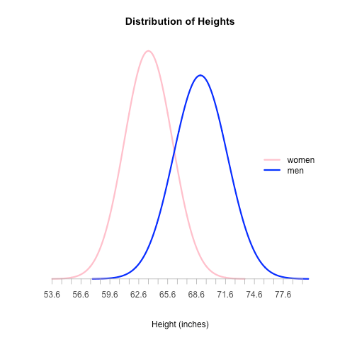
As a follow-up to my last post about how to render a normal distribution curve with R, here’s how you can render two on the same plot:
setClass(
	Class = "Distribution",
	representation = representation(
		name = "character",
		mean = "numeric",
		sd = "numeric",
		color = "character",
		x = "vector",
		y = "vector"
	)
)

# We rewrite the initialize method for Distribution objects so that we can
# set the x and y values which are used throughout the plotting process
setMethod(
	f = "initialize",
	signature = "Distribution",
	definition = function( .Object, name, mean, sd, color ) {
		.Object@name = name
		.Object@mean = mean
		.Object@sd = sd
		.Object@color = color
		.Object@x = seq( -4, 4, length = 1000 ) * sd + mean
		.Object@y = dnorm( .Object@x, mean, sd )

		return ( .Object )
	}
)

# Given a list of distributions, this returns a list of the x and y axis range
get_axis_ranges = function( distributions ) {
	x_all = vector()
	y_all = vector()

	for ( distribution in distributions ) {
		x_all = c( x_all, distribution@x )
		y_all = c( y_all, distribution@y )
	}

	xlim = c( min( x_all ), max( x_all ) )
	ylim = c( min( y_all ), max( y_all ) )

	# Note that by forming a list of the vectors, the vectors get converted to lists
	# which we then have to convert back to vectors in order to use them for plotting
	return ( list( xlim, ylim ) )
}

# Define the distributions that we want to plot
distributions = list(
	new( Class = "Distribution", name = "women", mean = 63.6, sd = 2.5, color = "pink" ),
	new( Class = "Distribution", name = "men", mean = 69, sd = 2.8, color = "blue" )
)

# Determine the range to use for each axis
axis_range = get_axis_ranges( distributions )
xlim = unlist( axis_range[ 1 ] )
ylim = unlist( axis_range[ 2 ] )

# Create the plot
plot( NULL, NULL, type = "n", xlim = xlim, ylim = ylim, xlab = "Height (inches)", ylab = "", main = "Distribution of Heights", axes = FALSE )

# Render each of the curves
line_width = 3
for( distribution in distributions ) {
	lines( distribution@x, distribution@y, col = distribution@color, lwd = line_width )
}

# Render the x axis
axis_bounds <- seq( min( xlim ), max( xlim ) )
axis( side = 1, at = axis_bounds, pos = 0, col = "#aaaaaa", col.axis = "#444444" )

# Finally, render a legend
legend_text = vector()
legend_colors = vector()
for ( distribution in distributions ) {
	legend_text = c( legend_text, distribution@name )
	legend_colors = c( legend_colors, distribution@color )
}
legend('right', legend_text, lty = 1, lwd = line_width, col = legend_colors, bty = 'n' )

