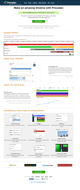
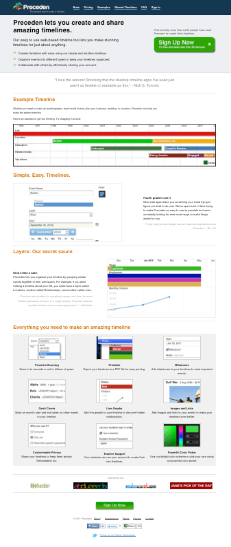
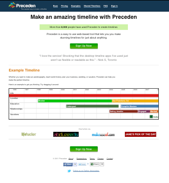
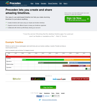
Preceden’s homepage can currently be divided into four sections (see below):
1) The splash screen (Make an amazing timeline with Preceden, Quote, Sign Up)
2) Example
3) Features
4) Featured On
I’ve been running an A/B test to determine the impact of the splash screen design and the features.
Here are the results along with their corresponding conversions rates. The conversion rates reflect the % of people that make it to the sign up page. (In future tests I’m going to measure the % that actually sign up, which is probably a better indication of a successful conversion.)
Note that I’m stopping this A/B test before Google Website Optimizer has reported a statistically significant result, but I’m eager to try additional variations and don’t want to wait any longer. So take these results with a grain of salt.
Original
Conversion rate: 17.2%
Combination 1: New splash screen
Conversion rate: 19.2% (11.4% improvement)
Combination 2: Original splash screen, no features
Conversion rate: 23.7% (37.3% improvement)
Combination 3: New splash screen, no features
Conversion rate: 18.3% (5.95% improvement)
Summary
Page Sections
###
The results were 180 degrees from what I expected. I’d have bet money that:
a) The sexier splash screen and call to action had a higher conversion rate. In fact, it decreased the conversion rate by 8.3%.
b) The shiny list of features would have had a higher conversion rate. In fact, not including the features increased the conversion rate by 15.1%.
The best result was with the original splash screen and without the list of features, which yielded a 37% higher conversion rate. Why? My theory is that in both cases, the landing page was simpler and people generally prefer simpler over more complex. Makes you appreciate why everything Google designs is dead-simple.
More to follow…


2 thoughts on “A/B Testing Preceden’s Homepage – Round 1: 37% Improvement”